Checkbox 复选框
介绍
在一组选项中进行多选,通常与 TnCheckboxGroup 配合使用。支持自定义颜色、形状、数量限制、半选状态及边框样式。
引入
typescript
import { TnCheckbox, TnCheckboxGroup } from "@tuniao/tn-ui";代码演示
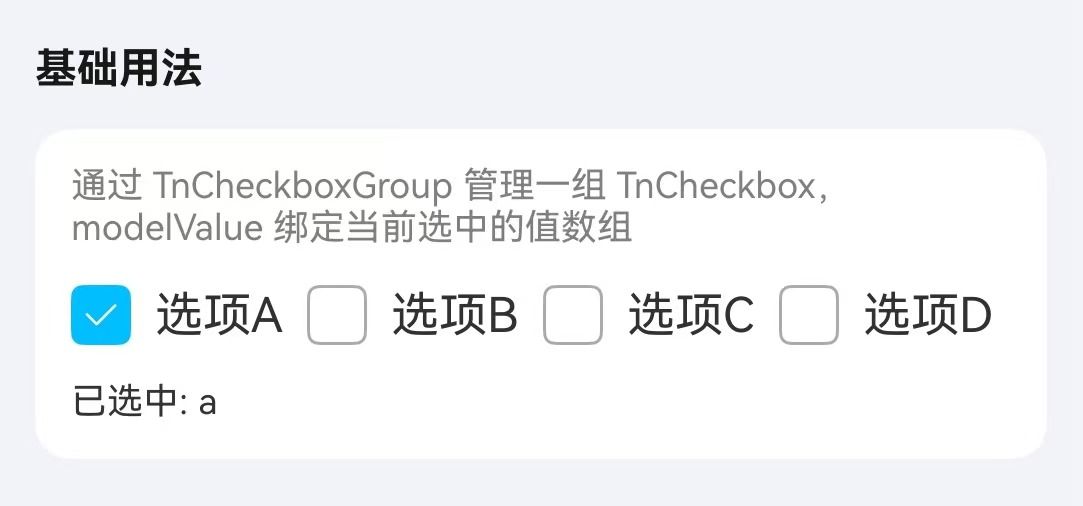
基础用法
通过 TnCheckboxGroup 包裹 TnCheckbox,使用 modelValue 绑定当前选中值数组。每个 TnCheckbox 通过 label 属性指定对应值。
点我查看代码
typescript
@Local checkboxValue: Array<string> = ["a"];
TnCheckboxGroup({
group: "fruit",
modelValue: this.checkboxValue,
onChange: (value: Array<string | number>) => {
this.checkboxValue = value as Array<string>;
},
}) {
TnCheckbox({ group: "fruit", label: "a" }) {
Text("选项A")
}
TnCheckbox({ group: "fruit", label: "b" }) {
Text("选项B")
}
TnCheckbox({ group: "fruit", label: "c" }) {
Text("选项C")
}
TnCheckbox({ group: "fruit", label: "d" }) {
Text("选项D")
}
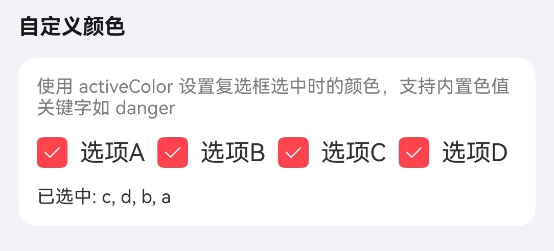
}自定义颜色
通过 activeColor 属性自定义选中时的颜色,可在 TnCheckboxGroup 上统一设置,也可在单个 TnCheckbox 上单独设置。
点我查看代码
typescript
@Local checkboxValue: Array<string> = ["a"];
TnCheckboxGroup({
group: "customColor",
modelValue: this.checkboxValue,
activeColor: "danger",
onChange: (value: Array<string | number>) => {
this.checkboxValue = value as Array<string>;
},
}) {
TnCheckbox({ group: "customColor", label: "a" }) {
Text("选项A");
};
TnCheckbox({ group: "customColor", label: "b" }) {
Text("选项B");
};
TnCheckbox({ group: "customColor", label: "c" }) {
Text("选项C");
};
TnCheckbox({ group: "customColor", label: "d" }) {
Text("选项D");
};
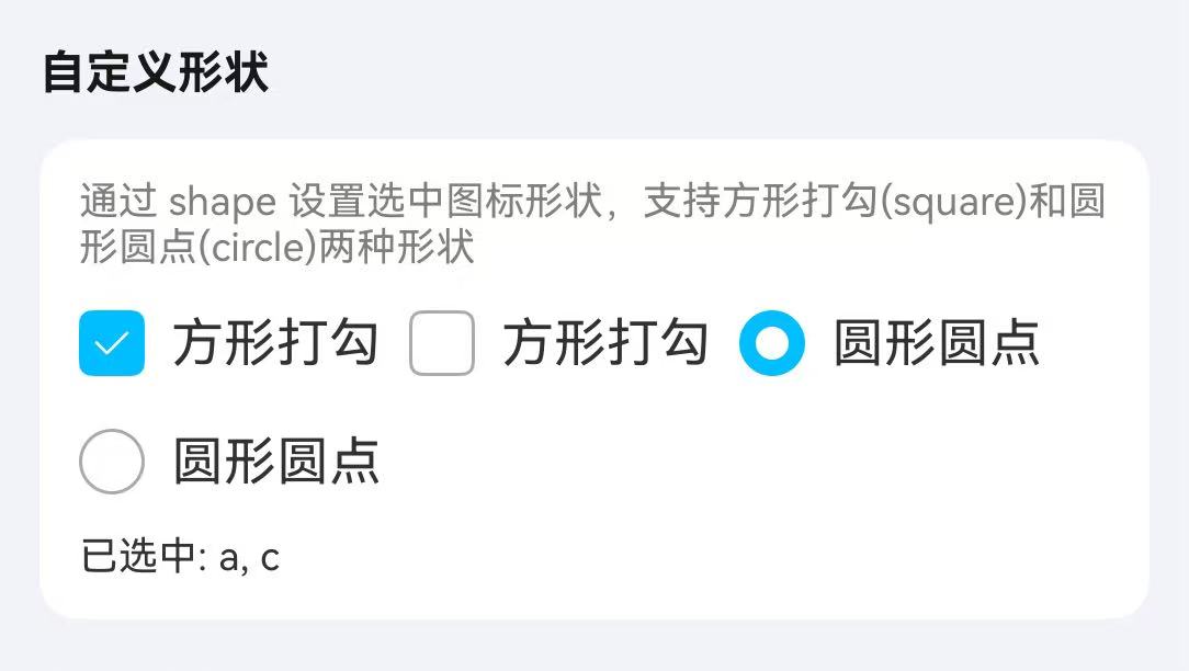
}形状
通过 shape 属性设置复选框形状,可选值为 square(方形,默认)和 circle(圆形)。
点我查看代码
typescript
@Local checkboxValue: Array<string> = ["a","c"];
TnCheckboxGroup({
group: "shape",
modelValue: this.checkboxValue,
wrap: true,
onChange: (value: Array<string | number>) => {
this.checkboxValue = value as Array<string>;
},
}) {
TnCheckbox({ group: "shape", label: "a", shape: TnCheckboxShape.SQUARE }) {
Text("方形打勾");
};
TnCheckbox({ group: "shape", label: "b", shape: TnCheckboxShape.SQUARE }) {
Text("方形打勾");
};
TnCheckbox({ group: "shape", label: "c", shape: TnCheckboxShape.CIRCLE }) {
Text("圆形圆点");
};
TnCheckbox({ group: "shape", label: "d", shape: TnCheckboxShape.CIRCLE }) {
Text("圆形圆点");
};
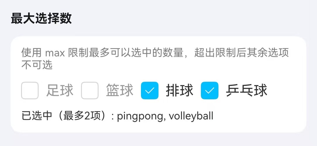
}限制数量
通过 min 和 max 属性限制可选数量。
点我查看代码
typescript
@Local checkboxValue: Array<string> = ["volleyball"];

TnCheckboxGroup({
  group: "maxLimit",
  modelValue: this.checkboxValue,
  min: 1,
  max: 2,
  onChange: (value: Array<string | number>) => {
    this.checkboxValue = value as Array<string>;
  },
}) {
  TnCheckbox({ group: "maxLimit", label: "football" }) {
    Text("足球");
  };
  TnCheckbox({ group: "maxLimit", label: "basketball" }) {
    Text("篮球");
  };
  TnCheckbox({ group: "maxLimit", label: "volleyball" }) {
    Text("排球");
  };
  TnCheckbox({ group: "maxLimit", label: "pingpong" }) {
    Text("乒乓球");
  };
}
半选状态
通过 indeterminate 属性设置复选框为半选状态,常用于实现全选效果。
点我查看代码
typescript
@Local checkAll: boolean = false;
@Local isIndeterminate: boolean = true;
@Local checkboxValue: Array<string> = ["apple"];
private allOptions: Array<string> = ["apple", "banana", "orange"];
TnCheckbox({
group: "all",
label: "all",
indeterminate: this.isIndeterminate,
onChange: () => {
if (this.checkAll) {
this.checkboxValue = [];
this.checkAll = false;
} else {
this.checkboxValue = [...this.allOptions];
this.checkAll = true;
}
this.isIndeterminate = false;
},
}) {
Text("全选")
}
TnCheckboxGroup({
group: "fruit",
modelValue: this.checkboxValue,
onChange: (value: Array<string | number>) => {
this.checkboxValue = value as Array<string>;
this.checkAll = value.length === this.allOptions.length;
this.isIndeterminate = value.length > 0 && value.length < this.allOptions.length;
},
}) {
TnCheckbox({ group: "fruit", label: "apple" }) {
Text("苹果")
}
TnCheckbox({ group: "fruit", label: "banana" }) {
Text("香蕉")
}
TnCheckbox({ group: "fruit", label: "orange" }) {
Text("橘子")
}
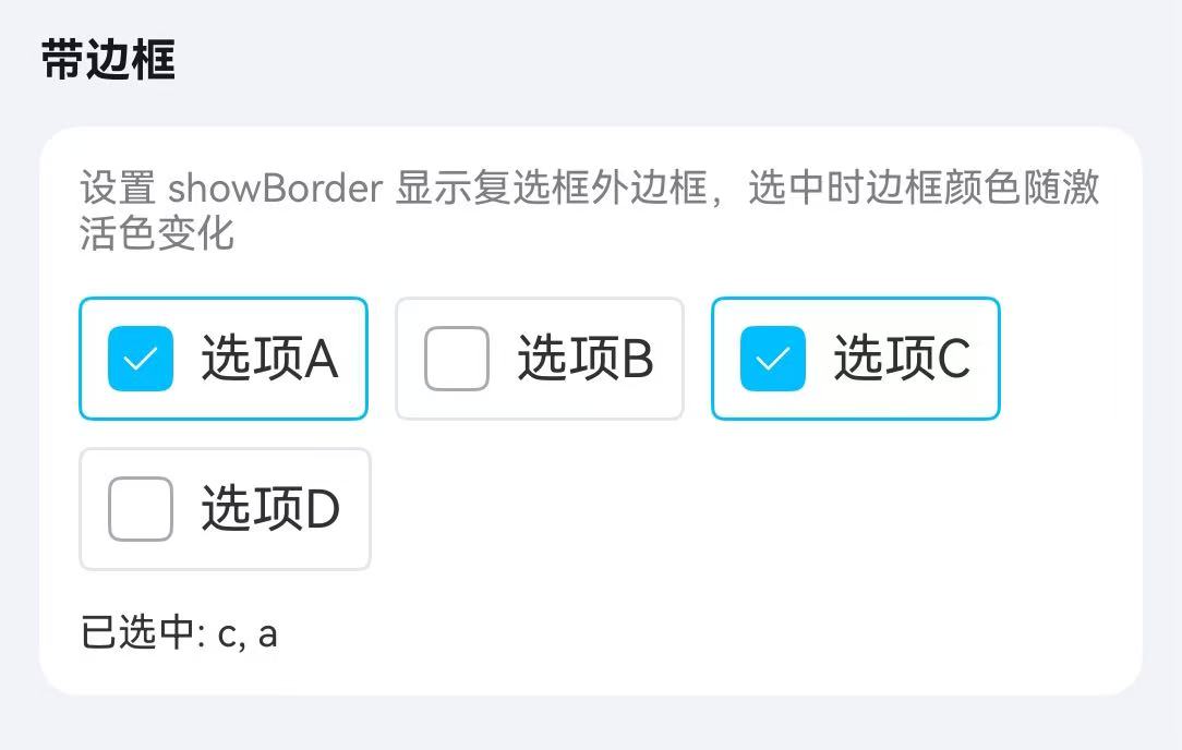
}边框样式
通过 showBorder 属性开启边框样式,选中时边框高亮显示。
点我查看代码
typescript
@Local checkboxValue: Array<string> = ["a"];
TnCheckboxGroup({
group: "border",
modelValue: this.checkboxValue,
wrap: true,
onChange: (value: Array<string | number>) => {
this.checkboxValue = value as Array<string>;
},
}) {
TnCheckbox({ group: "border", label: "a", showBorder: true }) {
Text("选项A");
};
TnCheckbox({ group: "border", label: "b", showBorder: true }) {
Text("选项B");
};
TnCheckbox({ group: "border", label: "c", showBorder: true }) {
Text("选项C");
};
TnCheckbox({ group: "border", label: "d", showBorder: true }) {
Text("选项D");
};
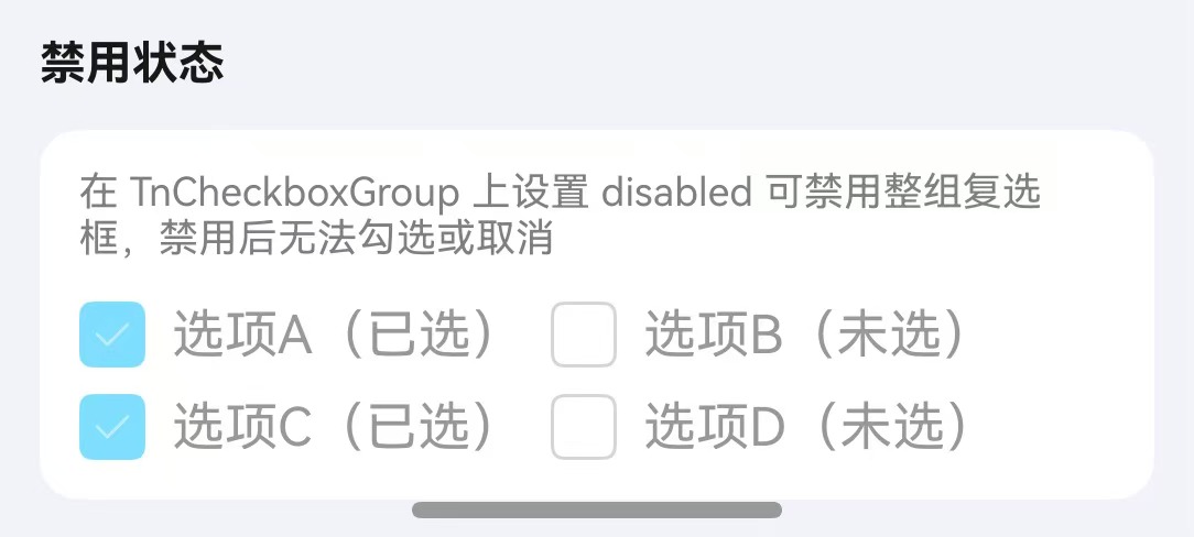
}禁用状态
通过 disabled 属性禁用复选框。可在 TnCheckboxGroup 上统一设置,也可在单个 TnCheckbox 上单独设置。
点我查看代码
typescript
@Local checkboxValue: Array<string> = ["a", "c"];

// 全部禁用
TnCheckboxGroup({
  group: "disabled",
  modelValue: this.checkboxValue,
  disabled: true,
}) {
  TnCheckbox({ group: "disabled", label: "a" }) {
    Text("选项A(已选)");
  };
  TnCheckbox({ group: "disabled", label: "b" }) {
    Text("选项B(未选)");
  };
  TnCheckbox({ group: "disabled", label: "c" }) {
    Text("选项C(已选)");
  };
  TnCheckbox({ group: "disabled", label: "d" }) {
    Text("选项D(未选)");
  };
}

// 单个禁用
TnCheckboxGroup({
  group: "fruit2",
  modelValue: this.checkboxValue,
  onChange: (value: Array<string | number>) => {
    this.checkboxValue = value as Array<string>;
  },
}) {
  TnCheckbox({ group: "fruit2", label: "apple" }) {
    Text("苹果")
  }
  TnCheckbox({ group: "fruit2", label: "banana", disabled: true }) {
    Text("香蕉(禁用)")
  }
}
API
TnCheckboxGroup Props
| 参数 | 说明 | 类型 | 默认值 |
|---|---|---|---|
| group | 复选框组标识 | string | - |
| modelValue | 当前选中值数组 | Array<string | number> | - |
| disabled | 是否禁用整组 | boolean | false |
| wrap | 是否水平排列并换行 | boolean | false |
| activeColor | 选中时的颜色 | string | - |
| groupSize | 复选框组统一大小 | number | - |
| min | 最少可选数量 | number | 0 |
| max | 最多可选数量 | number | Infinity |
TnCheckbox Props
| 参数 | 说明 | 类型 | 默认值 |
|---|---|---|---|
| group | 所属复选框组标识 | string | - |
| label | 复选框对应的值 | TnCheckboxValueType | - |
| disabled | 是否禁用 | boolean | false |
| labelDisabled | 是否禁用文字点击切换 | boolean | false |
| activeColor | 选中时的颜色 | string | - |
| checkboxSize | 复选框大小 | number | - |
| showBorder | 是否显示边框 | boolean | false |
| indeterminate | 是否为半选状态 | boolean | false |
| shape | 复选框形状 | TnCheckboxShape | "square" |
TnCheckboxShape
typescript
type TnCheckboxShape = "square" | "circle";TnCheckboxGroup Events
| 事件名 | 说明 | 回调参数 |
|---|---|---|
| onChange | 选中值变化时触发 | (value: Array<string | number>) => void |
TnCheckbox Slots
| 名称 | 说明 |
|---|---|
| defaultBuilder | 自定义复选框标签内容,通过尾随闭包传入 |
TnCheckbox Events
| 事件名 | 说明 | 回调参数 |
|---|---|---|
| onChange | 选中状态变化时触发 | (value: TnCheckboxValueType) => void |
类型定义
typescript
type TnCheckboxValueType = string | number;