Swiper 轮播图
介绍
轮播图组件,用于循环展示一组图片或内容,支持多种切换动画效果(滑动、淡入淡出、缩放、卡片、翻转),提供圆点、线条、数字三种指示器样式,适用于首页 Banner、广告位、图片展示等场景。
引入
import { TnSwiper } from "@tuniao/tn-ui";代码演示
基础用法
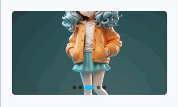
通过 data 属性传入图片 URL 地址数组即可展示轮播图,默认显示圆点指示器。

点我查看代码
import { TnSwiper, TnToast } from "@tuniao/tn-ui";

@Entry
@ComponentV2
struct SwiperBasic {
  private images: string[] = [
    "https://resource.tuniaokj.com/images/swiper/swiper1.jpg",
    "https://resource.tuniaokj.com/images/swiper/swiper2.jpg",
    "https://resource.tuniaokj.com/images/swiper/swiper3.jpg",
    "https://resource.tuniaokj.com/images/swiper/swiper4.jpg",
    "https://resource.tuniaokj.com/images/swiper/swiper5.jpg"
  ];

  build() {
    Column() {
      TnSwiper({
        data: this.images,
        onItemClick: (index: number) => {
          TnToast.show(`点击了第 ${index + 1} 张`);
        }
      });
    }
    .padding(15)
  }
}
自动播放
设置 autoplay 为 true 开启自动轮播,通过 interval 控制播放间隔(毫秒),配合 loop 实现循环播放。

点我查看代码
TnSwiper({
  data: this.images,
  autoplay: true,
  interval: 3000,
  loop: true
});
指示器类型
通过 indicatorType 设置指示器类型,支持 "dot"(圆点)、"line"(线条)、"number"(数字)三种样式。

点我查看代码
// 圆点指示器(默认)
TnSwiper({
  data: this.images,
  indicatorType: "dot",
  loop: true
});

// 线条指示器
TnSwiper({
  data: this.images,
  indicatorType: "line",
  loop: true
});

// 数字指示器
TnSwiper({
  data: this.images,
  indicatorType: "number",
  loop: true
});
指示器位置
通过 indicatorPosition 控制指示器的显示位置,支持 6 种位置。

点我查看代码
// 右下角 + 数字指示器
TnSwiper({
  data: this.images,
  indicatorType: "number",
  indicatorPosition: "right-bottom"
});

// 左下角 + 圆点指示器
TnSwiper({
  data: this.images,
  indicatorType: "dot",
  indicatorPosition: "left-bottom"
});

// 顶部居中 + 线条指示器
TnSwiper({
  data: this.images,
  indicatorType: "line",
  indicatorPosition: "center-top"
});
自定义指示器颜色
通过 indicatorBgColor 和 indicatorActiveBgColor 分别设置指示器的默认颜色和选中颜色。

点我查看代码
import { TnSwiper, TnUIBaseStyle, TnUIBaseStyleType, getThemeColor } from "@tuniao/tn-ui";
import { AppStorageV2 } from "@kit.ArkUI";
import { TnAppStorageKey } from "@tuniao/tn-ui/src/main/ets/common/storage_key";

@Entry
@ComponentV2
struct SwiperIndicatorColor {
  @Local baseStyle: TnUIBaseStyleType = AppStorageV2.connect(TnUIBaseStyle, TnAppStorageKey.BASE_STYLE)!;

  private images: string[] = [
    "https://resource.tuniaokj.com/images/swiper/swiper1.jpg",
    "https://resource.tuniaokj.com/images/swiper/swiper2.jpg",
    "https://resource.tuniaokj.com/images/swiper/swiper3.jpg"
  ];

  build() {
    Column() {
      TnSwiper({
        data: this.images,
        indicatorType: "dot",
        indicatorBgColor: $r("app.color.tn_color_white"),
        indicatorActiveBgColor: getThemeColor(this.baseStyle, "danger"),
        loop: true
      });
    }
    .padding(15)
  }
}
动画效果
通过 effect 设置不同的切换动画效果,支持 5 种效果。所有效果在手动滑动和自动播放时都能看到完整的过渡动画。
标准滑动 (slide)
默认效果,图片平移切换。
点我查看代码
TnSwiper({
  data: this.images,
  effect: "slide",
  loop: true,
  autoplay: true,
  interval: 4000
});
淡入淡出 (fade)
当前页不透明度为 1,非当前页淡出至 0.3。
点我查看代码
TnSwiper({
  data: this.images,
  effect: "fade",
  loop: true,
  autoplay: true,
  interval: 4000
});
缩放切换 (scale)
当前页正常大小,非当前页缩小至 0.8 倍。

点我查看代码
TnSwiper({
  data: this.images,
  effect: "scale",
  loop: true,
  autoplay: true,
  interval: 4000
});
卡片效果 (card)
卡片层叠效果,当前页缩放 1.0 + 完全不透明,两侧缩小至 0.85 + 半透明,自动添加前后露出间距和阴影。
点我查看代码
TnSwiper({
  data: this.images,
  effect: "card",
  loop: true,
  autoplay: true,
  interval: 4000
});
翻转效果 (flip)
页面沿 Y 轴旋转,左侧页面正旋转 45 度,右侧页面反旋转 45 度。

点我查看代码
TnSwiper({
  data: this.images,
  effect: "flip",
  loop: true,
  autoplay: true,
  interval: 4000
});
前后露出
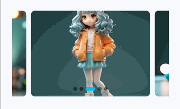
通过 previousMargin 和 nextMargin 设置前一项和后一项的露出间距,实现一屏显示多张图片的效果。设置露出间距后会自动添加项间距。
点我查看代码
TnSwiper({
  data: this.images,
  previousMargin: 30,
  nextMargin: 30,
  loop: true
});
隐藏指示器
设置 showIndicator 为 false 隐藏指示器。
点我查看代码
TnSwiper({
  data: this.images,
  showIndicator: false
});
自定义高度
通过 swiperHeight 设置轮播图高度,支持数值(vp)和字符串(百分比等)。

点我查看代码
// 高度 120vp
TnSwiper({
  data: this.images,
  swiperHeight: 120,
  loop: true
});

// 高度 240vp
TnSwiper({
  data: this.images,
  swiperHeight: 240,
  loop: true
});
自定义圆角
通过 imgBorderRadius 修改图片的圆角大小,默认为 baseStyle.borderRadiusLg。

点我查看代码
// 无圆角
TnSwiper({
  data: this.images,
  imgBorderRadius: 0,
  loop: true
});

// 大圆角
TnSwiper({
  data: this.images,
  imgBorderRadius: 20,
  loop: true
});
自定义动画时长
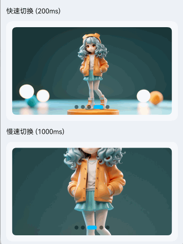
通过 duration 控制切换动画速度(毫秒)。
点我查看代码
// 快速切换(200ms)
TnSwiper({
  data: this.images,
  duration: 200,
  loop: true,
  autoplay: true,
  interval: 2000
});

// 慢速切换(1000ms)
TnSwiper({
  data: this.images,
  duration: 1000,
  loop: true,
  autoplay: true,
  interval: 4000
});
监听切换事件
通过 onChange 监听轮播切换完成事件,回调参数为当前索引。
点我查看代码
import { TnSwiper, TnToast } from "@tuniao/tn-ui";

@Entry
@ComponentV2
struct SwiperChange {
  @Local currentIndex: number = 0;

  private images: string[] = [
    "https://resource.tuniaokj.com/images/swiper/swiper1.jpg",
    "https://resource.tuniaokj.com/images/swiper/swiper2.jpg",
    "https://resource.tuniaokj.com/images/swiper/swiper3.jpg"
  ];

  build() {
    Column({ space: 15 }) {
      TnSwiper({
        data: this.images,
        currentIndex: this.currentIndex,
        onChange: (index: number) => {
          this.currentIndex = index;
          TnToast.show(`当前第 ${index + 1} 张`);
        }
      });
    }
    .padding(15)
  }
}
API
Props
| 参数 | 说明 | 类型 | 默认值 |
|---|---|---|---|
| data | 图片地址列表 | string[] | [] |
| currentIndex | 当前选中的轮播项索引 | number | 0 |
| swiperWidth | 轮播图宽度,支持数值(vp)和字符串 | string | number | "100%" |
| swiperHeight | 轮播图高度,支持数值(vp)和字符串 | string | number | 180 |
| autoplay | 是否自动播放 | boolean | false |
| interval | 自动播放间隔时间(毫秒) | number | 5000 |
| duration | 切换动画时长(毫秒) | number | 500 |
| loop | 是否循环播放 | boolean | false |
| previousMargin | 前一项露出的间距(vp) | number | 0 |
| nextMargin | 后一项露出的间距(vp) | number | 0 |
| itemSpace | 项目之间的间距(vp),前后露出或卡片模式时默认 10 | number | - |
| showIndicator | 是否显示指示器 | boolean | true |
| indicatorPosition | 指示器位置 | TnSwiperIndicatorPosition | "center-bottom" |
| indicatorType | 指示器类型 | TnSwiperIndicatorType | "dot" |
| indicatorBgColor | 指示器默认颜色 | ResourceColor | - |
| indicatorActiveBgColor | 指示器选中颜色 | ResourceColor | - |
| indicatorTextColor | 数字指示器文字颜色 | ResourceColor | - |
| effect | 切换动画效果 | TnSwiperEffect | "slide" |
| imgMode | 图片显示模式 | ImageFit | ImageFit.Cover |
| imgBorderRadius | 图片圆角(vp) | number | baseStyle.borderRadiusLg |
Events
| 事件名 | 说明 | 回调参数 |
|---|---|---|
| onChange | 轮播切换完成时触发 | (index: number) => void |
| onItemClick | 点击轮播项时触发 | (index: number) => void |
类型定义
/**
 * 指示器类型
 * - dot: 圆点指示器(默认)
 * - line: 线条指示器
 * - number: 数字指示器
 */
type TnSwiperIndicatorType = "dot" | "line" | "number";

/**
 * 指示器位置
 * - left-top: 左上角
 * - center-top: 顶部居中
 * - right-top: 右上角
 * - left-bottom: 左下角
 * - center-bottom: 底部居中(默认)
 * - right-bottom: 右下角
 */
type TnSwiperIndicatorPosition =
  | "left-top"
  | "center-top"
  | "right-top"
  | "left-bottom"
  | "center-bottom"
  | "right-bottom";

/**
 * 切换动画效果
 * - slide: 标准滑动(默认)
 * - fade: 淡入淡出
 * - scale: 缩放切换
 * - card: 卡片层叠
 * - flip: 翻转切换
 */
type TnSwiperEffect = "slide" | "fade" | "scale" | "card" | "flip";