NoticeBar 通知栏
介绍
通知栏组件,用于在页面顶部循环展示通知消息。支持水平滚动(跑马灯)、垂直轮播、可关闭、链接跳转等多种模式,以及自定义图标、颜色、圆角、滚动速度等。
引入
typescript
import { TnNoticeBar } from "@tuniao/tn-ui";代码演示
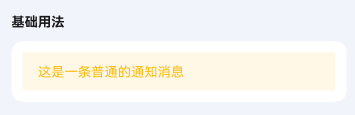
基础用法
通过 text 属性设置通知栏的文本内容。
点我查看代码
typescript
TnNoticeBar({
text: "这是一条普通的通知消息",
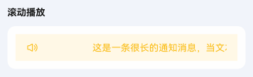
})滚动播放
当文本内容超出通知栏宽度时,会自动开启滚动播放(跑马灯效果)。通过 leftIcon 属性设置左侧图标。
点我查看代码
typescript
TnNoticeBar({
text: "这是一条很长的通知消息,当文本内容超出通知栏宽度时会自动滚动播放,实现跑马灯效果展示完整内容",
leftIcon: "sound",
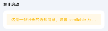
})禁止滚动
通过 scrollable 属性设置为 false,即使文本溢出也不会滚动,超出部分以省略号显示。
点我查看代码
typescript
TnNoticeBar({
text: "这是一条很长的通知消息,设置 scrollable 为 false 后即使文本溢出也不会滚动,超出部分用省略号表示",
scrollable: false,
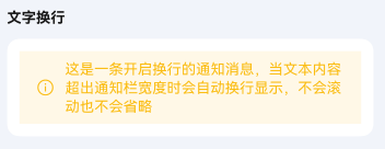
})文字换行
通过 wrapable 属性开启文字换行,文本超出时会自动换行显示,不会滚动也不会省略。
点我查看代码
typescript
TnNoticeBar({
text: "这是一条开启换行的通知消息,当文本内容超出通知栏宽度时会自动换行显示,不会滚动也不会省略",
wrapable: true,
leftIcon: "tip",
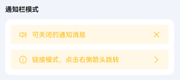
})通知栏模式
通过 mode 属性设置通知栏的模式。closeable 模式右侧显示关闭图标,点击可关闭通知栏;link 模式右侧显示箭头图标,用于跳转场景。
点我查看代码
typescript
// 可关闭模式
TnNoticeBar({
text: "可关闭的通知消息",
mode: "closeable",
leftIcon: "sound",
onClose: () => {
console.info("通知栏已关闭");
},
})
// 链接模式
TnNoticeBar({
text: "链接模式,点击右侧箭头跳转",
mode: "link",
leftIcon: "tip",
onRightIconClick: () => {
console.info("点击了链接箭头");
},
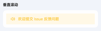
})垂直滚动
通过 scrollDirection 属性设置为 "vertical" 开启垂直轮播模式,使用 data 属性传入通知数据列表。
点我查看代码
typescript
TnNoticeBar({
  scrollDirection: "vertical",
  data: [
    "图鸟UI v1.0.3 版本已发布",
    "新增 NoticeBar 通知栏组件",
    "修复已知问题,提升稳定性",
    "欢迎提交 Issue 反馈问题",
  ],
  leftIcon: "sound",
  onTextClick: (index: number) => {
    console.info(`点击了第 ${index + 1} 条通知`);
  },
})
自定义垂直滚动间隔
通过 verticalInterval 属性设置垂直轮播的切换间隔时间,单位为秒,默认 3 秒。
点我查看代码
typescript
TnNoticeBar({
scrollDirection: "vertical",
data: [
"快速切换 - 间隔2秒",
"第二条通知消息",
"第三条通知消息",
],
verticalInterval: 2,
leftIcon: "tip",
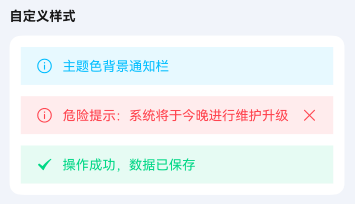
})自定义样式
通过 bgColor、textColor、leftIconColor 等属性自定义通知栏的颜色。
点我查看代码
typescript
import {
TnNoticeBar,
getThemeColor,
getThemeColorLight,
TnUIBaseStyle,
TnUIBaseStyleType,
} from "@tuniao/tn-ui";
import { AppStorageV2 } from "@kit.ArkUI";
import { TnAppStorageKey } from "@tuniao/tn-ui/src/main/ets/common/storage_key";
@Entry
@ComponentV2
struct NoticeBarCustomStyle {
@Local baseStyle: TnUIBaseStyleType = AppStorageV2.connect(TnUIBaseStyle, TnAppStorageKey.BASE_STYLE)!;
build() {
Column({ space: "12vp" }) {
// 主题色背景
TnNoticeBar({
text: "主题色背景通知栏",
bgColor: getThemeColorLight(this.baseStyle, "primary", "light_9"),
textColor: getThemeColor(this.baseStyle, "primary"),
leftIcon: "tip",
leftIconColor: getThemeColor(this.baseStyle, "primary"),
})
// 危险色背景
TnNoticeBar({
text: "危险提示:系统将于今晚进行维护升级",
bgColor: getThemeColorLight(this.baseStyle, "danger", "light_9"),
textColor: getThemeColor(this.baseStyle, "danger"),
leftIcon: "tip",
leftIconColor: getThemeColor(this.baseStyle, "danger"),
mode: "closeable",
rightIconColor: getThemeColor(this.baseStyle, "danger"),
})
// 成功色背景
TnNoticeBar({
text: "操作成功,数据已保存",
bgColor: getThemeColorLight(this.baseStyle, "success", "light_9"),
textColor: getThemeColor(this.baseStyle, "success"),
leftIcon: "check",
leftIconColor: getThemeColor(this.baseStyle, "success"),
})
}
}
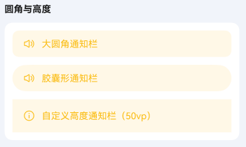
}自定义圆角
通过 radius 属性设置通知栏的圆角大小。
点我查看代码
typescript
import { TnNoticeBar, TnUIBaseStyle, TnUIBaseStyleType } from "@tuniao/tn-ui";
import { AppStorageV2 } from "@kit.ArkUI";
import { TnAppStorageKey } from "@tuniao/tn-ui/src/main/ets/common/storage_key";

@Entry
@ComponentV2
struct NoticeBarRadius {
  @Local baseStyle: TnUIBaseStyleType = AppStorageV2.connect(TnUIBaseStyle, TnAppStorageKey.BASE_STYLE)!;

  build() {
    Column({ space: "12vp" }) {
      // 大圆角
      TnNoticeBar({
        text: "大圆角通知栏",
        radius: this.baseStyle.borderRadiusXl,
        leftIcon: "sound",
      })

      // 胶囊形
      TnNoticeBar({
        text: "胶囊形通知栏",
        radius: this.baseStyle.borderRadiusMax,
        leftIcon: "sound",
      })
    }
  }
}
自定义高度
通过 barHeight 属性设置通知栏的高度,单位为 vp,默认 40。
点我查看代码
typescript
TnNoticeBar({
  text: "自定义高度通知栏(50vp)",
  barHeight: 50,
  leftIcon: "tip",
})
自定义滚动速度
通过 speed 属性设置水平滚动的速度,单位为 vp/s,默认 60。
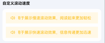
点我查看代码
typescript
// 慢速滚动(30vp/s)
TnNoticeBar({
  text: "慢速滚动(30vp/s):这是一条很长的通知消息,用于展示慢速滚动效果,阅读起来更加轻松",
  speed: 30,
  leftIcon: "sound",
})

// 快速滚动(120vp/s)
TnNoticeBar({
  text: "快速滚动(120vp/s):这是一条很长的通知消息,用于展示快速滚动效果,信息传递更加迅速",
  speed: 120,
  leftIcon: "sound",
})
事件回调
通知栏支持 onBarClick(通知栏点击)、onLeftIconClick(左侧图标点击)、onRightIconClick(右侧图标点击)等事件回调。
点我查看代码
typescript
TnNoticeBar({
  text: "点击通知栏触发回调",
  leftIcon: "tip",
  mode: "link",
  onBarClick: () => {
    console.info("点击了通知栏");
  },
  onLeftIconClick: () => {
    console.info("点击了左侧图标");
  },
  onRightIconClick: () => {
    console.info("点击了右侧图标");
  },
})
自定义左右侧内容
通过 leftBuilder 和 rightBuilder 插槽可自定义通知栏左右侧的内容,替代默认的图标区域。
点我查看代码
typescript
@Entry
@ComponentV2
struct NoticeBarSlots {
  @Builder
  customLeft() {
    Text("公告")
      .fontColor("#FF6B00")
      .fontSize("12vp")
      .fontWeight(FontWeight.Bold)
      .margin({ right: "8vp" })
  }

  build() {
    Column() {
      TnNoticeBar({
        text: "使用自定义左侧内容替代默认图标",
        leftBuilder: () => {
          this.customLeft();
        },
      })
    }
  }
}
API
Props
| 参数 | 说明 | 类型 | 默认值 |
|---|---|---|---|
| text | 通知文本内容(水平模式使用) | string | "" |
| data | 通知数据列表(垂直模式使用) | string[] | [] |
| scrollDirection | 滚动方向 | TnNoticeBarDirection | "horizontal" |
| mode | 通知栏模式 | TnNoticeBarMode | - |
| bgColor | 自定义背景色 | ResourceColor | 主题 warning 浅色 |
| textColor | 自定义文字色 | ResourceColor | 主题 warning 色 |
| fontSize | 自定义文字大小 | number | string | 主题默认字号 |
| leftIcon | 左侧图标名称 | string | "" |
| leftIconColor | 左侧图标颜色 | ResourceColor | 同文字色 |
| leftIconSize | 左侧图标大小(vp) | number | 18 |
| rightIcon | 右侧图标名称(优先级高于 mode 自动图标) | string | "" |
| rightIconColor | 右侧图标颜色 | ResourceColor | 同文字色 |
| rightIconSize | 右侧图标大小(vp) | number | 18 |
| barHeight | 通知栏高度 | number | string | 40 |
| scrollable | 是否开启滚动播放,undefined 时文字溢出自动开启 | boolean | undefined | undefined |
| wrapable | 是否换行显示(为 true 时滚动不生效) | boolean | false |
| speed | 水平滚动速度(vp/s) | number | 60 |
| delay | 滚动动画开始延迟时间(秒) | number | 1 |
| verticalInterval | 垂直滚动切换间隔(秒) | number | 3 |
| loop | 是否循环播放 | boolean | true |
| radius | 圆角大小 | number | string | 0 |
| leftRightPadding | 左右内边距 | number | string | 主题默认间距 |
BuilderParams
| 参数 | 说明 | 类型 |
|---|---|---|
| leftBuilder | 自定义左侧内容(覆盖 leftIcon) | CustomBuilder |
| rightBuilder | 自定义右侧内容(覆盖 rightIcon / mode 图标) | CustomBuilder |
Events
| 事件名 | 说明 | 回调参数 |
|---|---|---|
| onBarClick | 点击通知栏时触发 | () => void |
| onClose | 关闭通知栏时触发(closeable 模式) | () => void |
| onTextClick | 垂直模式下点击文本时触发 | (index: number) => void |
| onLeftIconClick | 点击左侧图标时触发 | () => void |
| onRightIconClick | 点击右侧图标时触发 | () => void |
类型定义
TnNoticeBarDirection
typescript
// 滚动方向
type TnNoticeBarDirection = "horizontal" | "vertical";
TnNoticeBarMode
typescript
// 通知栏模式
type TnNoticeBarMode = "closeable" | "link";