Button 按钮
介绍
常用的操作按钮,支持多种类型、尺寸、形状、图标及自定义样式。
引入
typescript
import { TnButton } from "@tuniao/tn-ui";代码演示
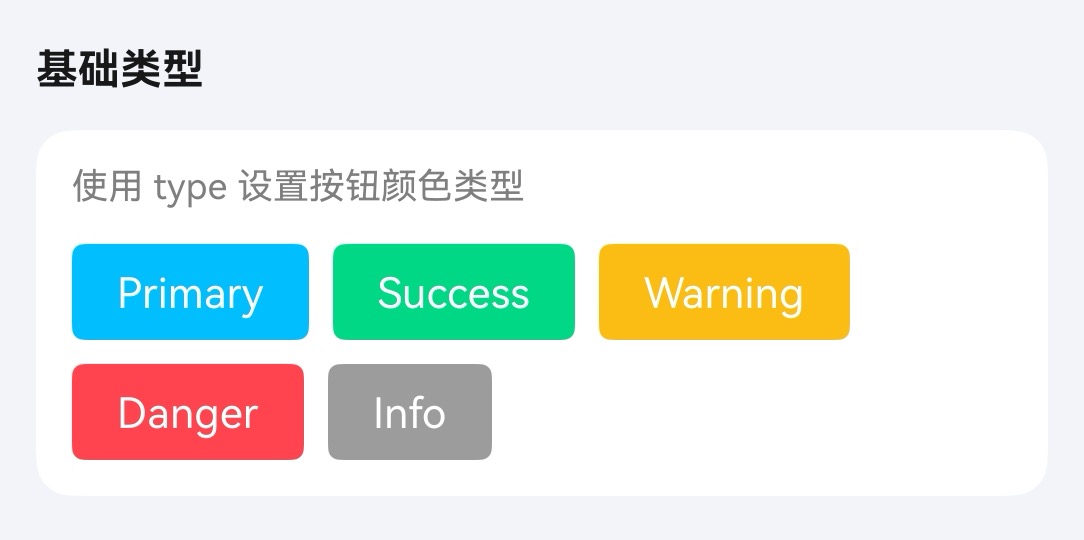
按钮类型
通过 type 属性设置按钮颜色类型。
点我查看代码
typescript
Column({ space: 10 }) {
TnButton({ content: "Primary", type: "primary" });
TnButton({ content: "Success", type: "success" });
TnButton({ content: "Warning", type: "warning" });
TnButton({ content: "Danger", type: "danger" });
TnButton({ content: "Info", type: "info" });
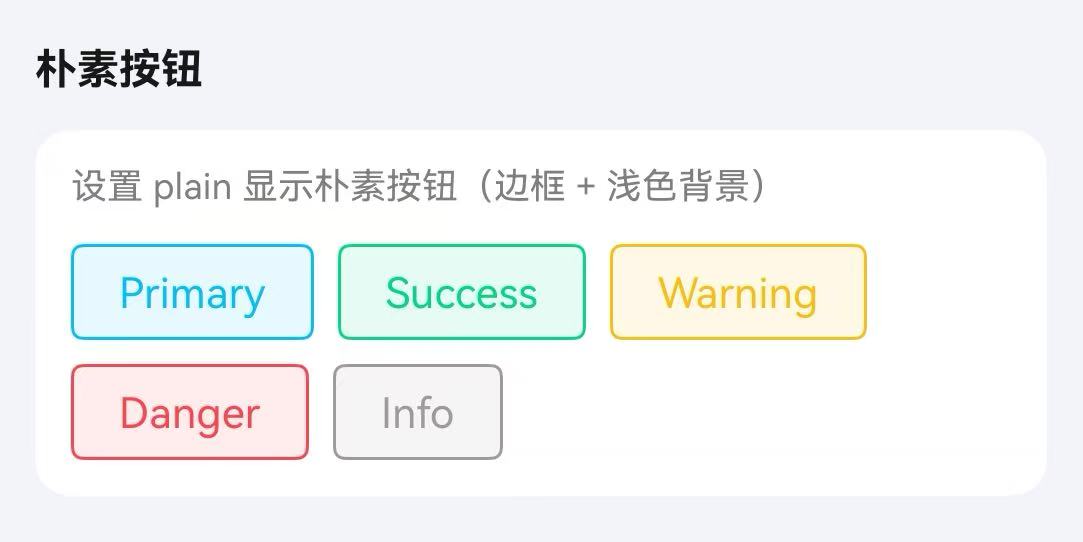
}朴素按钮
通过 plain 属性设置为朴素按钮,呈现边框 + 浅色背景的样式。
点我查看代码
typescript
Column({ space: 10 }) {
TnButton({ content: "Primary", type: "primary", plain: true });
TnButton({ content: "Success", type: "success", plain: true });
TnButton({ content: "Warning", type: "warning", plain: true });
TnButton({ content: "Danger", type: "danger", plain: true });
TnButton({ content: "Info", type: "info", plain: true });
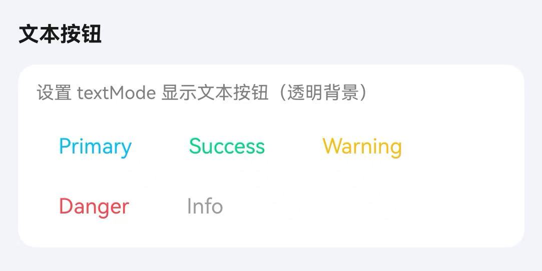
}文本按钮
通过 textMode 属性设置为文本按钮,背景透明。
点我查看代码
typescript
Column({ space: 10 }) {
TnButton({ content: "Primary", type: "primary", textMode: true });
TnButton({ content: "Success", type: "success", textMode: true });
TnButton({ content: "Warning", type: "warning", textMode: true });
TnButton({ content: "Danger", type: "danger", textMode: true });
TnButton({ content: "Info", type: "info", textMode: true });
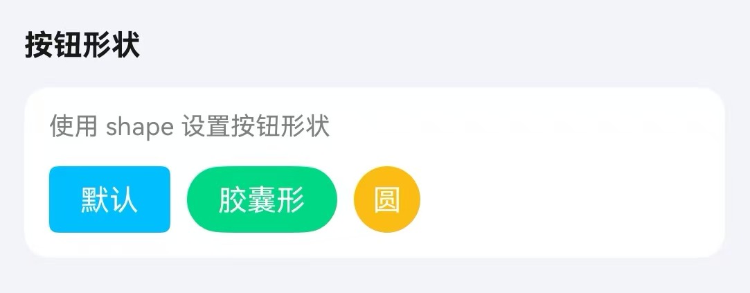
}按钮形状
通过 shape 属性设置按钮形状。
点我查看代码
typescript
Row({ space: 10 }) {
TnButton({ content: "默认", type: "primary" });
TnButton({ content: "胶囊形", type: "success", shape: "round" });
TnButton({ content: "圆", type: "warning", shape: "circle" });
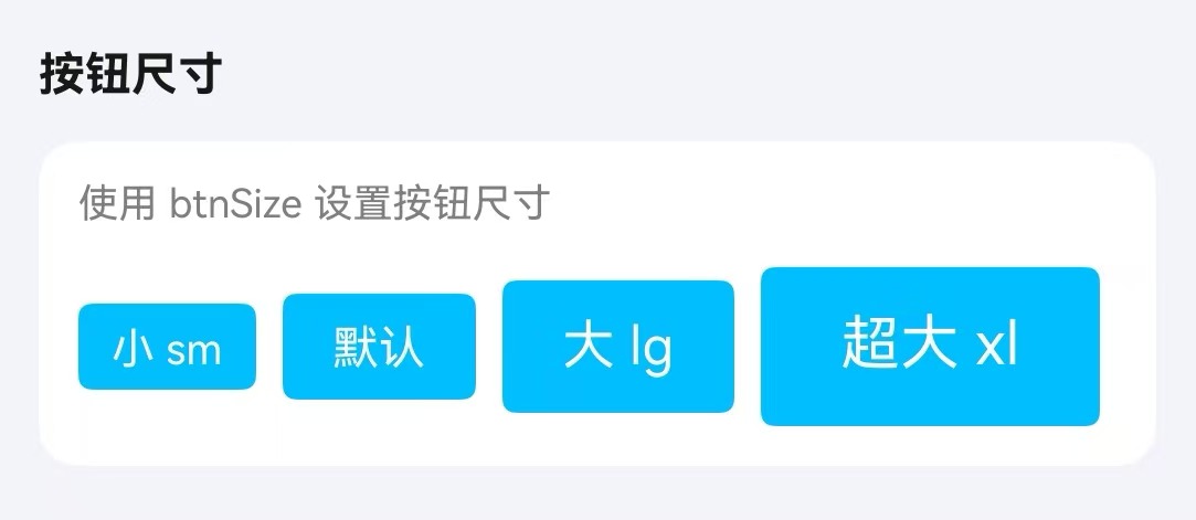
}按钮尺寸
通过 btnSize 属性设置按钮尺寸。
点我查看代码
typescript
Column({ space: 10 }) {
TnButton({ content: "小 sm", type: "primary", btnSize: "sm" });
TnButton({ content: "默认", type: "primary" });
TnButton({ content: "大 lg", type: "primary", btnSize: "lg" });
TnButton({ content: "超大 xl", type: "primary", btnSize: "xl" });
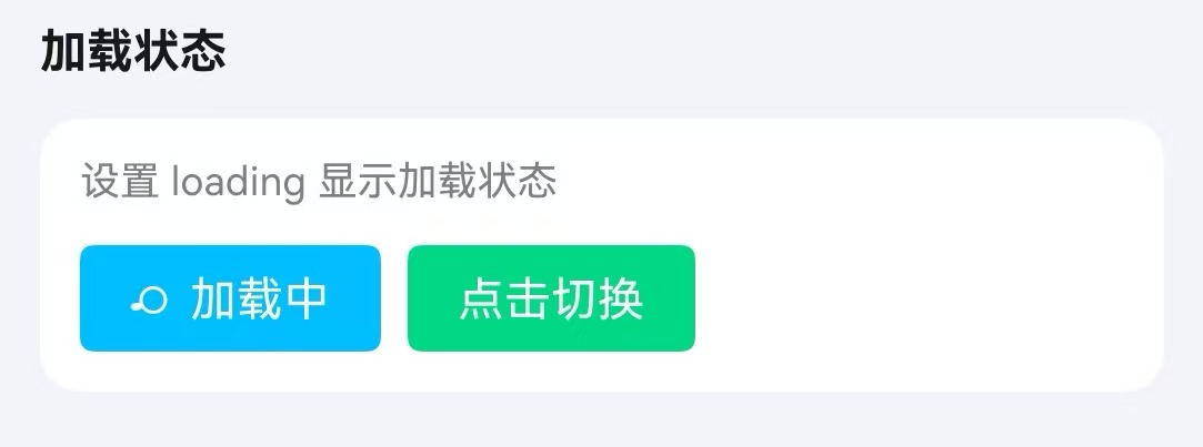
}加载状态
通过 loading 属性设置按钮加载状态。
点我查看代码
typescript
TnButton({ content: "加载中", type: "primary", loading: true });
TnButton({
content: this.vm.isLoading ? "加载中..." : "点击切换",
type: "success",
loading: this.vm.isLoading,
onBtnClick: () => {
this.vm.toggleLoading();
}
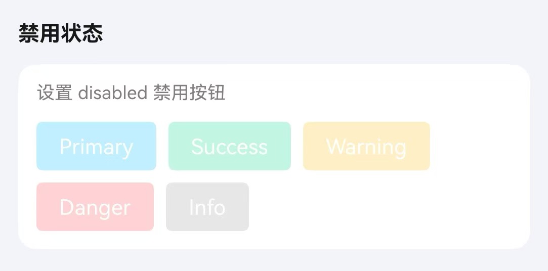
});禁用状态
通过 disabled 属性设置按钮禁用状态。
点我查看代码
typescript
Column({ space: 10 }) {
  TnButton({ content: "Primary", type: "primary", disabled: true });
  TnButton({ content: "Success", type: "success", disabled: true });
  TnButton({ content: "Warning", type: "warning", disabled: true });
  TnButton({ content: "Danger", type: "danger", disabled: true });
  TnButton({ content: "Info", type: "info", disabled: true });
}
图标按钮
通过 icon 属性设置按钮图标。
点我查看代码
typescript
Row({ space: 10 }) {
TnButton({ content: "搜索", icon: "search", type: "primary" });
TnButton({ content: "设置", icon: "set-fill", type: "success" });
TnButton({ icon: "home-capsule-fill", type: "warning", shape: "circle" });
TnButton({ content: "拍照", icon: "camera", type: "danger", shape: "round" });
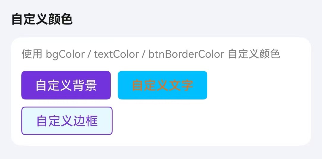
}自定义颜色
通过 bgColor、textColor、btnBorderColor 属性自定义按钮颜色。
点我查看代码
typescript
Column({ space: 10 }) {
TnButton({ content: "自定义背景", bgColor: "#7232dd", textColor: "#ffffff" });
TnButton({ content: "自定义文字", type: "primary", textColor: "#ff6700" });
TnButton({ content: "自定义边框", plain: true, btnBorderColor: "#7232dd", textColor: "#7232dd" });
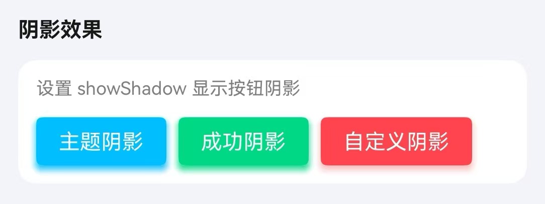
}阴影效果
通过 showShadow 属性开启按钮阴影效果。
点我查看代码
typescript
Column({ space: 10 }) {
  TnButton({ content: "主题阴影", type: "primary", showShadow: true });
  TnButton({ content: "成功阴影", type: "success", showShadow: true });
  TnButton({
    content: "自定义阴影",
    type: "danger",
    showShadow: true,
    shadowColor: "rgba(245,108,108,0.5)"
  });
}
点击防抖
通过 debounce 属性开启 250ms 点击防抖。
点我查看代码
typescript
TnButton({
  content: "防抖按钮",
  type: "primary",
  debounce: true,
  onBtnClick: () => {
    console.info("按钮点击(防抖)");
  },
})
API
Props
| 参数 | 说明 | 类型 | 默认值 |
|---|---|---|---|
| type | 按钮颜色类型 | TnButtonColorType | "primary" |
| btnSize | 按钮尺寸 | "sm" | "lg" | "xl" | - |
| shape | 按钮形状 | "circle" | "round" | - |
| textMode | 文本按钮模式 | boolean | false |
| plain | 朴素按钮 | boolean | false |
| disabled | 禁用状态 | boolean | false |
| loading | 加载状态 | boolean | false |
| bold | 加粗字体 | boolean | false |
| fontSize | 自定义字体大小 | number | string | - |
| bgColor | 自定义背景色 | ResourceColor | - |
| textColor | 自定义文字色 | ResourceColor | - |
| btnBorderColor | 自定义边框色 | ResourceColor | - |
| showShadow | 显示阴影 | boolean | false |
| shadowColor | 阴影颜色 | ResourceColor | - |
| icon | 图标名称 | string | "" |
| btnWidth | 自定义宽度 | number | string | - |
| btnHeight | 自定义高度 | number | string | - |
| debounce | 点击防抖(250ms) | boolean | false |
| content | 按钮文本 | ResourceStr | "" |
Slots
| 名称 | 说明 |
|---|---|
| defaultBuilder | 自定义按钮内容插槽,优先级高于 content。通过尾随闭包传入自定义 UI 内容 |
Events
| 事件名 | 说明 | 回调参数 |
|---|---|---|
| onBtnClick | 点击按钮时触发 | - |