
Sticky 吸顶
介绍
将内容固定在容器顶部,当页面滚动到指定位置时,内容自动吸附在顶部不随页面滚动。常用于导航栏、标签栏、工具栏等需要常驻可见的场景。
引入
typescript
import { TnSticky } from "@tuniao/tn-ui";代码演示
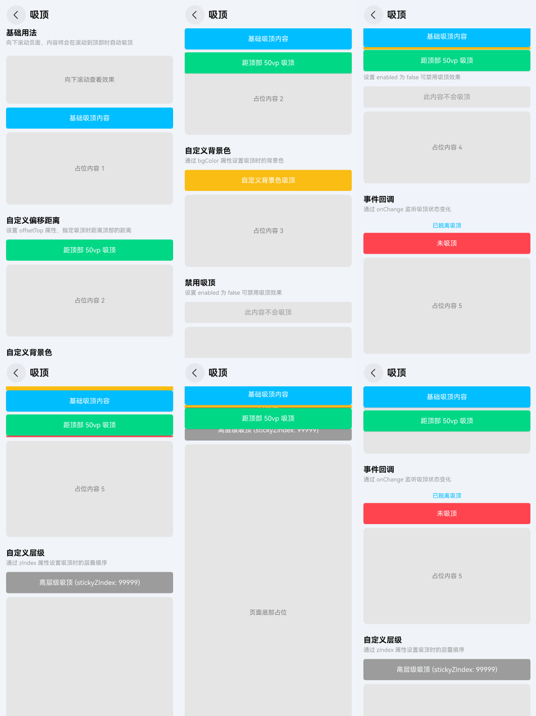
基础用法
将需要吸顶的内容放入 TnSticky 的尾随闭包中,并将父级 Scroll 的滚动偏移量传入 scrollTop 参数。当页面滚动到组件位置时,内容会自动吸顶。
点我查看代码
typescript
@Local scrollTop: number = 0;
private scroller: Scroller = new Scroller();

// 在 build 中
Scroll(this.scroller) {
  Column() {
    Text("普通内容").height(200)
    TnSticky({ scrollTop: this.scrollTop }) {
      Row() {
        Text("吸顶内容")
          .fontColor($r("app.color.tn_color_white"))
      }
      .width("100%")
      .height(44)
      .justifyContent(FlexAlign.Center)
      .backgroundColor(getThemeColor(this.baseStyle, "primary"))
    }
    Text("更多内容...").height(1000)
  }
}
.onDidScroll(() => {
  this.scrollTop = this.scroller.currentOffset().yOffset;
})
自定义偏移距离
通过 offsetTop 属性设置吸顶时距离容器顶部的距离(单位 vp)。
点我查看代码
typescript
TnSticky({ scrollTop: this.scrollTop, offsetTop: 50 }) {
  Row() {
    Text("距顶部 50vp 吸顶")
      .fontColor($r("app.color.tn_color_white"))
  }
  .width("100%")
  .height(44)
  .justifyContent(FlexAlign.Center)
  .backgroundColor(getThemeColor(this.baseStyle, "success"))
}
自定义背景色
通过 bgColor 属性设置吸顶时的背景色。吸顶后背景色会遮挡下方内容,默认使用组件库背景色。
点我查看代码
typescript
TnSticky({
  scrollTop: this.scrollTop,
  bgColor: getThemeColor(this.baseStyle, "warning")
}) {
  Row() {
    Text("自定义背景色吸顶")
      .fontColor($r("app.color.tn_color_white"))
  }
  .width("100%")
  .height(44)
  .justifyContent(FlexAlign.Center)
  .backgroundColor(getThemeColor(this.baseStyle, "warning"))
}
禁用吸顶
设置 stickyEnabled 为 false 可禁用吸顶效果,内容将正常随页面滚动。
点我查看代码
typescript
TnSticky({ scrollTop: this.scrollTop, stickyEnabled: false }) {
  Row() {
    Text("此内容不会吸顶")
      .fontColor($r("app.color.tn_text_color_secondary"))
  }
  .width("100%")
  .height(44)
  .justifyContent(FlexAlign.Center)
  .backgroundColor($r("app.color.tn_color_gray_disabled"))
}
自定义层级
通过 stickyZIndex 属性设置吸顶时的层叠顺序,用于解决与其他浮层组件的层级冲突。
点我查看代码
typescript
TnSticky({ scrollTop: this.scrollTop, stickyZIndex: 99999 }) {
  Row() {
    Text("高层级吸顶")
      .fontColor($r("app.color.tn_color_white"))
  }
  .width("100%")
  .height(44)
  .justifyContent(FlexAlign.Center)
  .backgroundColor(getThemeColor(this.baseStyle, "info"))
}
吸顶状态回调
通过 onChange 事件监听吸顶状态变化,true 表示已吸顶,false 表示已脱离吸顶。
点我查看代码
typescript
@Local isFixed: boolean = false;
@Local changeLog: string = "";

TnSticky({
  scrollTop: this.scrollTop,
  onChange: (fixed: boolean) => {
    this.isFixed = fixed;
    this.changeLog = fixed ? "已吸顶" : "已脱离吸顶";
  }
}) {
  Row() {
    Text(this.isFixed ? "已吸顶" : "未吸顶")
      .fontColor($r("app.color.tn_color_white"))
  }
  .width("100%")
  .height(44)
  .justifyContent(FlexAlign.Center)
  .backgroundColor(getThemeColor(this.baseStyle, "danger"))
}
使用说明
配合 Scroll 使用
TnSticky 需要配合 Scroll 容器使用。父级 Scroll 需要通过 onDidScroll 回调将当前滚动偏移量传递给 TnSticky 的 scrollTop 参数:
typescript
@Local scrollTop: number = 0;
private scroller: Scroller = new Scroller();

Scroll(this.scroller) {
  Column() {
    // ... 其他内容
    TnSticky({ scrollTop: this.scrollTop }) {
      // 吸顶内容
    }
    // ... 其他内容
  }
}
.onDidScroll(() => {
  this.scrollTop = this.scroller.currentOffset().yOffset;
})
注意事项
scrollTop参数必须与父级Scroll的实际滚动偏移量保持同步,否则吸顶时机不准确。- 吸顶时组件会自动添加背景色和阴影,防止内容穿透。如需自定义背景色,使用
bgColor参数。 - 组件通过
translate实现吸顶效果,不会脱离文档流,不影响其他元素布局。 - 同一个
Scroll容器中可以放置多个TnSticky,它们会各自独立计算吸顶状态。
API
Props
| 参数 | 说明 | 类型 | 默认值 |
|---|---|---|---|
| stickyEnabled | 是否开启粘性布局 | boolean | true |
| scrollTop | 父级 Scroll 容器的当前滚动偏移量(yOffset) | number | 0 |
| offsetTop | 吸顶时距离顶部的距离,单位 vp | number | 0 |
| stickyZIndex | 吸顶时的 z-index 层级 | number | 10030 |
| bgColor | 吸顶时的背景色 | ResourceColor | $r("app.color.tn_bg_color") |
Events
| 事件名 | 说明 | 回调参数 |
|---|---|---|
| onChange | 吸顶状态变化时触发 | (fixed: boolean) => void |
Slots
| 名称 | 说明 |
|---|---|
| defaultBuilder | 默认内容插槽,用于放置需要吸顶的内容,通过尾随闭包传入 |