Icon 图标
介绍
基于图鸟图标字体的图标组件,支持字体图标和图片图标两种方式。
引入
typescript
import { TnIcon } from "@tuniao/tn-ui";代码演示
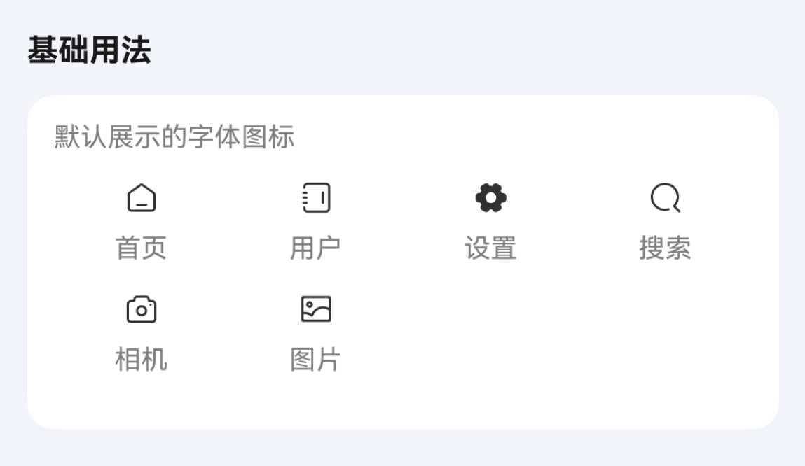
基础用法
通过 name 属性指定图标名称。
点我查看代码
typescript
@Entry
@ComponentV2
struct IconDemo {
build() {
Row({ space: 15 }) {
TnIcon({ name: "home" })
TnIcon({ name: "user" })
TnIcon({ name: "set-fill" })
TnIcon({ name: "search" })
TnIcon({ name: "camera" })
TnIcon({ name: "image" })
}
}
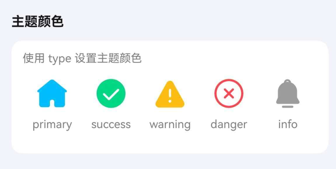
}主题颜色
通过 type 属性设置主题颜色类型。
点我查看代码
typescript
Row({ space: 15 }) {
TnIcon({ name: "home-capsule-fill", type: "primary" })
TnIcon({ name: "success-circle-fill", type: "success" })
TnIcon({ name: "warning-fill", type: "warning" })
TnIcon({ name: "close-circle", type: "danger" })
TnIcon({ name: "notice-fill", type: "info" })
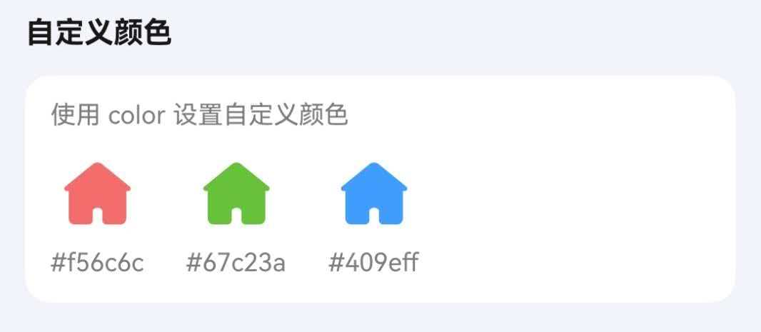
}自定义颜色
通过 color 属性设置自定义颜色。
点我查看代码
typescript
Row({ space: 15 }) {
TnIcon({ name: "home-capsule-fill", color: "#f56c6c" })
TnIcon({ name: "home-capsule-fill", color: "#67c23a" })
TnIcon({ name: "home-capsule-fill", color: "#409eff" })
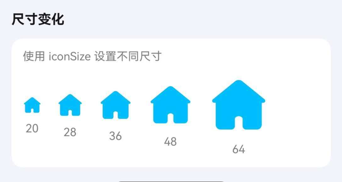
}图标尺寸
通过 iconSize 属性设置图标大小。
点我查看代码
typescript
Row({ space: 15 }) {
TnIcon({ name: "home-capsule-fill", type: "primary", iconSize: 20 });
TnIcon({ name: "home-capsule-fill", type: "primary", iconSize: 28 });
TnIcon({ name: "home-capsule-fill", type: "primary", iconSize: 36 });
TnIcon({ name: "home-capsule-fill", type: "primary", iconSize: 48 });
TnIcon({ name: "home-capsule-fill", type: "primary", iconSize: 64 });
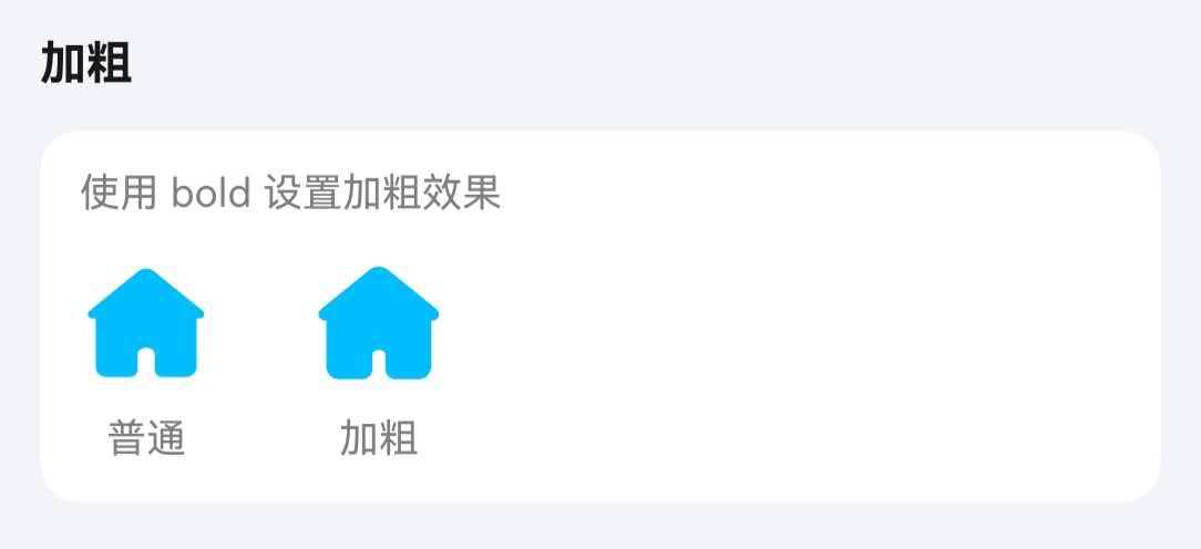
}加粗
通过 bold 属性使图标加粗显示。
点我查看代码
typescript
Row({ space: 15 }) {
  TnIcon({ name: "home-capsule-fill" })
  TnIcon({ name: "home-capsule-fill", bold: true })
}
图片图标
name 属性传入图片路径即可渲染图片图标。
点我查看代码
typescript
Row({ space: 15 }) {
TnIcon({ name: $r("app.media.icon_example"), iconSize: 40 })
TnIcon({ name: "https://vue3.tuniaokj.com/images/tuniao-logo.svg", iconSize: 40 })
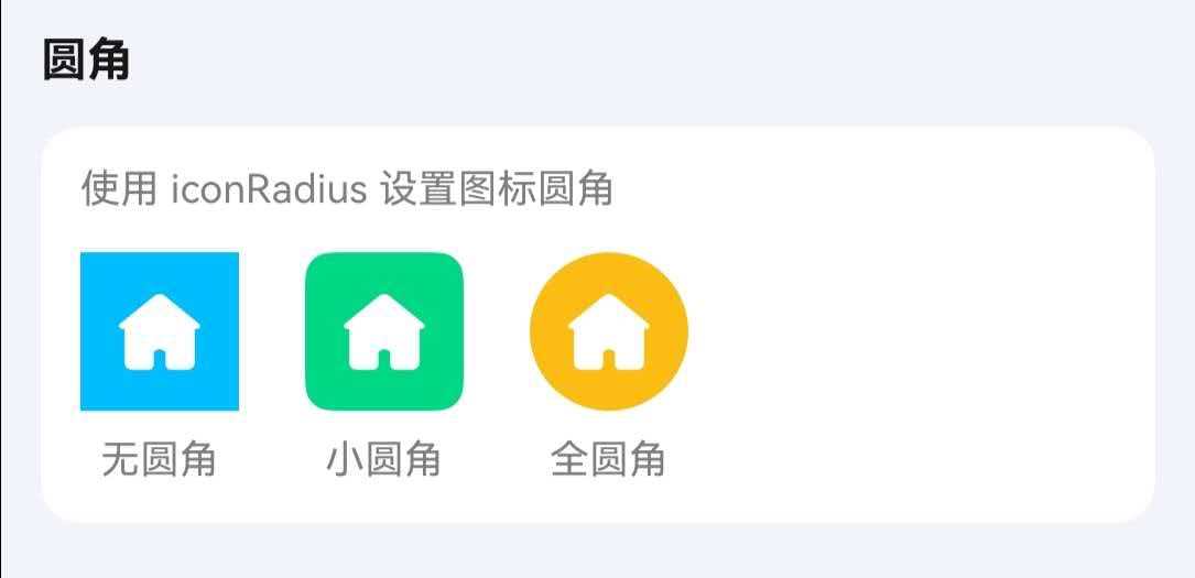
}圆角
通过 bgColor 设置背景色,iconPadding 设置图标与背景边缘的内间距,配合 iconRadius 实现带背景的圆角图标。
点我查看代码
typescript
Row({ space: 15 }) {
  // 无圆角
  TnIcon({
    name: "home-capsule-fill",
    color: Color.White,
    iconSize: 28,
    bgColor: $r("app.color.tn_color_primary"),
    iconPadding: 10,
    iconRadius: 0
  });
  // 小圆角
  TnIcon({
    name: "home-capsule-fill",
    color: Color.White,
    iconSize: 28,
    bgColor: $r("app.color.tn_color_success"),
    iconPadding: 10,
    iconRadius: 8
  });
  // 全圆角
  TnIcon({
    name: "home-capsule-fill",
    color: Color.White,
    iconSize: 28,
    bgColor: $r("app.color.tn_color_warning"),
    iconPadding: 10,
    iconRadius: 24
  });
}
点击事件
通过 onIconClick 回调处理点击事件。
点我查看代码
typescript
TnIcon({
  name: "star",
  type: "primary",
  onIconClick: () => {
    console.info("图标被点击了");
  },
})
API
Props
| 参数 | 说明 | 类型 | 默认值 |
|---|---|---|---|
| name | 图标名称或图片路径 | string | Resource | - |
| color | 自定义图标颜色 | ResourceColor | - |
| type | 主题颜色类型 | TnComponentColorType | - |
| iconSize | 图标尺寸 | number | string | - |
| bold | 是否加粗 | boolean | false |
| iconRadius | 图标圆角 | Length | 0 |
| bgColor | 图标背景色,设置后图标会包裹在带背景色的容器中 | ResourceColor | - |
| iconPadding | 图标内间距,配合 bgColor 使用 | number | Padding | - |
| customFontName | 自定义字体名称 | string | - |
Events
| 事件名 | 说明 | 回调参数 |
|---|---|---|
| onIconClick | 点击图标时触发 | (event: ClickEvent) => void |
类型定义
TnComponentColorType
typescript
type TnComponentColorType = "primary" | "success" | "warning" | "danger" | "error" | "info";