Tag 标签
介绍
用于标记和分类的标签组件,支持多种类型、形状、尺寸,以及可关闭功能。
引入
typescript
import { TnTag } from "@tuniao/tn-ui";代码演示
基础用法
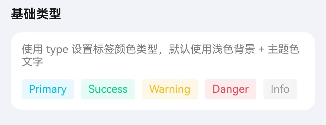
通过 text 属性设置标签文本,type 设置颜色类型。
点我查看代码
typescript
Row({ space: 10 }) {
  TnTag({ text: "Primary", type: "primary" });
  TnTag({ text: "Success", type: "success" });
  TnTag({ text: "Warning", type: "warning" });
  TnTag({ text: "Danger", type: "danger" });
  TnTag({ text: "Info", type: "info" });
}
标签形状
通过 shape 属性设置标签形状。

点我查看代码
typescript
Row({ space: 10 }) {
  TnTag({ text: "默认", type: "primary" });
  TnTag({ text: "圆形", type: "success", shape: "circle" });
  TnTag({ text: "圆角", type: "warning", shape: "round" });
  TnTag({ text: "左侧圆形", type: "danger", shape: "circleLeft" });
  TnTag({ text: "右侧圆形", type: "info", shape: "circleRight" });
}
标签尺寸
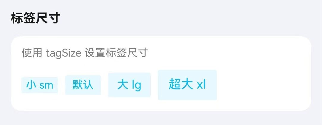
通过 tagSize 属性设置标签大小。
点我查看代码
typescript
Row({ space: 10 }) {
  TnTag({ text: "小 sm", type: "primary", tagSize: "sm" });
  TnTag({ text: "默认", type: "primary" });
  TnTag({ text: "大 lg", type: "primary", tagSize: "lg" });
  TnTag({ text: "超大 xl", type: "primary", tagSize: "xl" });
}
朴素模式
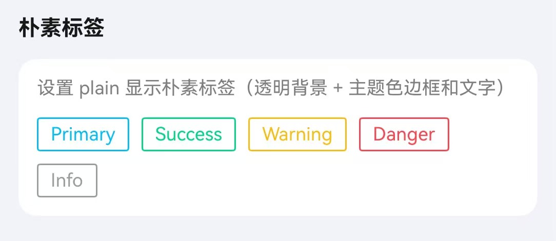
通过 plain 属性设置朴素模式。
点我查看代码
typescript
Row({ space: 10 }) {
  TnTag({ text: "Primary", type: "primary", plain: true });
  TnTag({ text: "Success", type: "success", plain: true });
  TnTag({ text: "Warning", type: "warning", plain: true });
  TnTag({ text: "Danger", type: "danger", plain: true });
  TnTag({ text: "Info", type: "info", plain: true });
}
可关闭标签
通过 closeable 属性使标签可关闭,配合 onClose 事件处理关闭逻辑。

点我查看代码
typescript
Flex({ wrap: FlexWrap.Wrap, space: { main: LengthMetrics.vp(8), cross: LengthMetrics.vp(8) } }) {
  if (this.vm.closeable1Visible) {
    TnTag({
      text: "可关闭",
      type: "primary",
      closeable: true,
      onClose: () => {
        this.vm.closeable1Visible = false;
      }
    });
  }
  if (this.vm.closeable2Visible) {
    TnTag({
      text: "朴素可关闭",
      type: "success",
      plain: true,
      closeable: true,
      onClose: () => {
        this.vm.closeable2Visible = false;
      }
    });
  }
  if (this.vm.closeable3Visible) {
    TnTag({
      text: "带边框可关闭",
      type: "danger",
      showBorder: true,
      closeable: true,
      onClose: () => {
        this.vm.closeable3Visible = false;
      }
    });
  }
}
自定义颜色
通过 bgColor、textColor、tagBorderColor 自定义样式。

点我查看代码
typescript
Flex({ wrap: FlexWrap.Wrap, space: { main: LengthMetrics.vp(8), cross: LengthMetrics.vp(8) } }) {
  TnTag({
    text: "紫色背景",
    bgColor: $r("app.color.tn_color_purple"),
    textColor: $r("app.color.tn_color_white")
  });
  TnTag({
    text: "靛蓝文字",
    type: "primary",
    textColor: $r("app.color.tn_color_indigo")
  });
  TnTag({
    text: "橙色背景",
    bgColor: $r("app.color.tn_color_orange"),
    textColor: $r("app.color.tn_color_white")
  });
  TnTag({
    text: "青色浅底",
    bgColor: $r("app.color.tn_color_cyan_light"),
    textColor: $r("app.color.tn_color_cyan")
  });
  TnTag({
    text: "棕色朴素",
    plain: true,
    tagBorderColor: $r("app.color.tn_color_brown"),
    textColor: $r("app.color.tn_color_brown")
  });
  TnTag({
    text: "红色背景",
    bgColor: $r("app.color.tn_color_red"),
    textColor: $r("app.color.tn_color_white")
  });
  TnTag({
    text: "灰色标签",
    bgColor: $r("app.color.tn_color_gray_light"),
    textColor: $r("app.color.tn_color_grey")
  });
}
API
Props
| 参数 | 说明 | 类型 | 默认值 |
|---|---|---|---|
| type | 标签颜色类型 | TnComponentColorType | "primary" |
| tagSize | 标签尺寸 | "sm" | "lg" | "xl" | - |
| shape | 标签形状 | "circle" | "round" | "circleLeft" | "circleRight" | - |
| text | 标签文本 | ResourceStr | "" |
| bgColor | 自定义背景色 | ResourceColor | - |
| textColor | 自定义文字色 | ResourceColor | - |
| showBorder | 是否显示边框 | boolean | false |
| tagBorderColor | 自定义边框色 | ResourceColor | - |
| borderBold | 边框是否加粗 | boolean | false |
| bold | 是否加粗字体 | boolean | false |
| fontSize | 自定义字体大小 | number | string | - |
| tagWidth | 自定义宽度 | number | string | - |
| tagHeight | 自定义高度 | number | string | - |
| plain | 朴素模式 | boolean | false |
| closeable | 是否可关闭 | boolean | false |
Slots
| 名称 | 说明 |
|---|---|
| defaultBuilder | 自定义标签内容插槽,优先级高于 text。通过尾随闭包传入自定义 UI 内容 |
Events
| 事件名 | 说明 | 回调参数 |
|---|---|---|
| onTagClick | 点击标签时触发 | - |
| onClose | 关闭标签时触发 | - |