Loading 加载
介绍
加载动画组件,用于在数据加载过程中提供视觉反馈,支持多种动画模式。
引入
typescript
import { TnLoading } from "@tuniao/tn-ui";代码演示
基础用法
通过 show 属性控制加载动画的显示。

点我查看代码
typescript
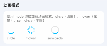
TnLoading();动画模式
通过 mode 属性设置加载动画样式。
点我查看代码
typescript
Row({ space: 20 }) {
TnLoading({ mode: "circle" });
TnLoading({ mode: "flower" });
TnLoading({ mode: "semicircle" });
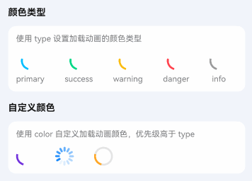
}颜色类型
通过 type 属性设置主题颜色。
点我查看代码
typescript
Row({ space: 20 }) {
TnLoading({ type: "primary" });
TnLoading({ type: "success" });
TnLoading({ type: "warning" });
TnLoading({ type: "danger" });
TnLoading({ type: "info" });
TnLoading({ color: "#7232dd" });
TnLoading({ color: "#1989fa", mode: "flower" });
TnLoading({ color: $r("app.color.tn_color_orange"), mode: "semicircle" });
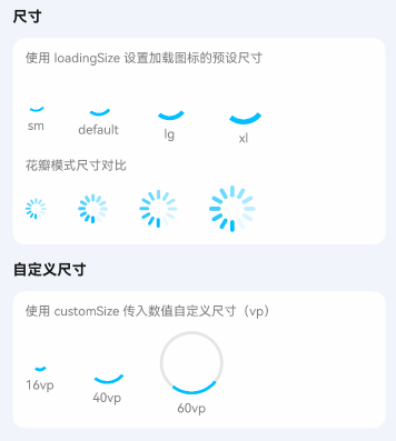
}自定义尺寸
通过 loadingSize 属性设置预设尺寸,或通过 customSize 设置具体数值。
点我查看代码
typescript
Row({ space: 20 }) {
TnLoading({ loadingSize: "sm" });
TnLoading();
TnLoading({ loadingSize: "lg" });
TnLoading({ loadingSize: "xl" });
TnLoading({ customSize: 60 });
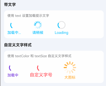
}加载文字
通过 text 属性显示加载提示文字。
点我查看代码
typescript
TnLoading({ text: "加载中..." });
TnLoading({ text: "请稍候", mode: "flower" });
TnLoading({ text: "Loading", mode: "semicircle" });
// 自定义文字样式
TnLoading({
  text: "加载中",
  textColor: "#7232dd",
  color: "#7232dd"
});
TnLoading({
  text: "自定义字号",
  textSize: 16,
  type: "danger"
});
TnLoading({
  text: "大图标",
  loadingSize: "xl",
  textColor: $r("app.color.tn_color_orange"),
  color: $r("app.color.tn_color_orange"),
  mode: "flower"
});
API
Props
| 参数 | 说明 | 类型 | 默认值 |
|---|---|---|---|
| show | 是否显示加载动画 | boolean | true |
| mode | 加载动画模式 | "circle" | "flower" | "semicircle" | "circle" |
| type | 颜色类型 | TnComponentColorType | "primary" |
| color | 自定义颜色 | ResourceColor | - |
| loadingSize | 加载图标尺寸 | "sm" | "lg" | "xl" | - |
| customSize | 自定义尺寸数值(vp) | number | - |
| duration | 动画持续时间(ms) | number | 1000 |
| timingCurve | 动画缓动函数 | Curve | Curve.Linear |
| text | 加载提示文字 | string | - |
| textColor | 文字颜色 | ResourceColor | - |
| textSize | 文字大小 | number | string | - |