Empty 空白页
介绍
空白页组件,用于数据为空时展示空白提示。支持 14 种预设模式(购物车、搜索、网络、订单等),可自定义图标、提示文案、颜色、尺寸,也支持通过插槽完全自定义内容。
引入
typescript
import { TnEmpty } from "@tuniao/tn-ui";代码演示
基础用法
通过 mode 属性设置空白页类型,默认为 data。组件会自动展示对应的图标和提示文案。

点我查看代码
typescript
TnEmpty({ mode: "data" })空白页模式
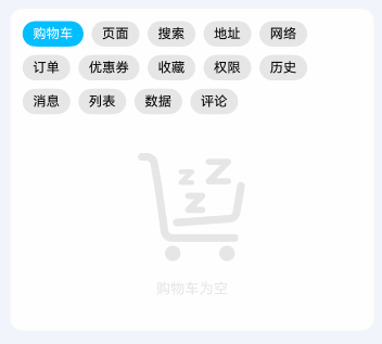
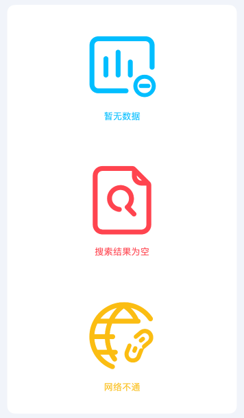
支持 14 种预设模式,涵盖常见的空白场景:
| 模式 | 说明 | 默认提示 |
|---|---|---|
cart | 购物车为空 | 购物车为空 |
page | 页面不存在 | 页面不存在 |
search | 搜索结果为空 | 搜索结果为空 |
address | 地址为空 | 地址为空 |
network | 网络异常 | 网络不通 |
order | 订单为空 | 订单为空 |
coupon | 优惠券为空 | 优惠券为空 |
favor | 暂无收藏 | 暂无收藏 |
permission | 无权限 | 无权限 |
history | 历史记录为空 | 历史记录为空 |
message | 暂无消息 | 暂无消息 |
list | 列表为空 | 列表为空 |
data | 暂无数据 | 暂无数据 |
comment | 暂无评论 | 暂无评论 |
点我查看代码
typescript
TnEmpty({ mode: "cart" })
TnEmpty({ mode: "search" })
TnEmpty({ mode: "network" })
TnEmpty({ mode: "order" })
TnEmpty({ mode: "favor" })
TnEmpty({ mode: "message" })
自定义颜色
通过 color 属性修改空白页内容(图标和文字)的颜色。支持 ResourceColor 类型,可使用主题色、资源色等。
点我查看代码
typescript
import {
  TnEmpty, getThemeColor,
  TnUIBaseStyle, TnUIBaseStyleType
} from "@tuniao/tn-ui";
import { TnAppStorageKey } from "@tuniao/tn-ui/src/main/ets/common/storage_key";
import { AppStorageV2 } from "@kit.ArkUI";

@Entry
@ComponentV2
struct EmptyCustomColor {
  @Local baseStyle: TnUIBaseStyleType = AppStorageV2.connect(TnUIBaseStyle, TnAppStorageKey.BASE_STYLE)!;

  build() {
    Column({ space: 20 }) {
      // 使用主题主色
      TnEmpty({
        mode: "data",
        color: getThemeColor(this.baseStyle, "primary")
      })
      // 使用危险色
      TnEmpty({
        mode: "search",
        color: getThemeColor(this.baseStyle, "danger")
      })
      // 使用警告色
      TnEmpty({
        mode: "network",
        color: getThemeColor(this.baseStyle, "warning")
      })
    }
  }
}
预设尺寸
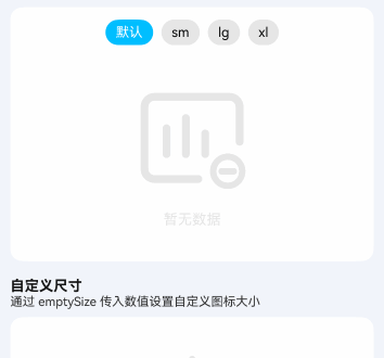
通过 emptySize 属性设置预设尺寸,可选值为 sm、lg、xl。不同尺寸会影响图标大小和提示文字字号。
| 尺寸 | 图标大小 | 说明 |
|---|---|---|
| 默认 | 120 | 默认尺寸 |
sm | 80 | 小尺寸 |
lg | 160 | 大尺寸 |
xl | 200 | 超大尺寸 |
点我查看代码
typescript
import { TnEmpty, TnEmptySizeType } from "@tuniao/tn-ui";

// 小尺寸
TnEmpty({ mode: "data", emptySize: "sm" as TnEmptySizeType })

// 默认尺寸
TnEmpty({ mode: "data" })

// 大尺寸
TnEmpty({ mode: "data", emptySize: "lg" as TnEmptySizeType })

// 超大尺寸
TnEmpty({ mode: "data", emptySize: "xl" as TnEmptySizeType })
自定义尺寸
emptySize 也支持传入数值,直接设置图标大小(单位跟随全局配置),提示文字字号会按比例自动计算。

点我查看代码
typescript
TnEmpty({ mode: "favor", emptySize: 60 })隐藏提示文字
通过 showTips 属性设置为 false,隐藏底部提示文字,仅展示图标。

点我查看代码
typescript
TnEmpty({ mode: "data", showTips: false })自定义提示文案
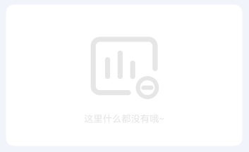
通过 tips 属性自定义提示文案,优先于默认提示。
点我查看代码
typescript
TnEmpty({ mode: "data", tips: "这里什么都没有哦~" })自定义图标内容
通过 iconBuilder 插槽完全自定义图标区域的内容,可以放置图片、自定义图标等。

点我查看代码
typescript
import { TnEmpty, TnIcon, getThemeColor, TnUIBaseStyle, TnUIBaseStyleType } from "@tuniao/tn-ui";
import { TnAppStorageKey } from "@tuniao/tn-ui/src/main/ets/common/storage_key";
import { AppStorageV2 } from "@kit.ArkUI";
@Entry
@ComponentV2
struct EmptyCustomIcon {
@Local baseStyle: TnUIBaseStyleType = AppStorageV2.connect(TnUIBaseStyle, TnAppStorageKey.BASE_STYLE)!;
@Builder CustomIcon(): void {
TnIcon({
name: "logo-tuniao",
color: getThemeColor(this.baseStyle, "primary"),
iconSize: 80
})
}
build() {
Column() {
TnEmpty({
mode: "data",
tips: "用户不存在",
iconBuilder: (): void => this.CustomIcon()
})
}
}
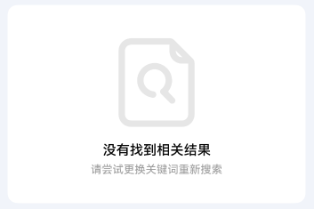
}自定义提示文字内容
通过 tipsBuilder 插槽完全自定义提示文字区域,可以放置多行文本、富文本等内容。
点我查看代码
typescript
import { TnEmpty, TnUIBaseStyle, TnUIBaseStyleType } from "@tuniao/tn-ui";
import { TnAppStorageKey } from "@tuniao/tn-ui/src/main/ets/common/storage_key";
import { AppStorageV2 } from "@kit.ArkUI";
@Entry
@ComponentV2
struct EmptyCustomTips {
@Local baseStyle: TnUIBaseStyleType = AppStorageV2.connect(TnUIBaseStyle, TnAppStorageKey.BASE_STYLE)!;
@Builder CustomTips(): void {
Column({ space: this.baseStyle.spaceXs }) {
Text("没有找到相关结果")
.fontSize(this.baseStyle.fontSizeLg)
.fontColor($r("app.color.tn_text_color_primary"))
.fontWeight(FontWeight.Medium)
.lineHeight(this.baseStyle.lineHeightMd)
Text("请尝试更换关键词重新搜索")
.fontSize(this.baseStyle.fontSizeSm)
.fontColor($r("app.color.tn_text_color_secondary"))
.lineHeight(this.baseStyle.lineHeightXsm)
}
.alignItems(HorizontalAlign.Center)
}
build() {
Column() {
TnEmpty({
mode: "search",
tipsBuilder: (): void => this.CustomTips()
})
}
}
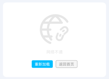
}底部自定义内容
通过 defaultBuilder 插槽在空白页底部添加自定义内容,如操作按钮、跳转链接等。
点我查看代码
typescript
import { TnEmpty, TnButton, TnUIBaseStyle, TnUIBaseStyleType } from "@tuniao/tn-ui";
import { TnAppStorageKey } from "@tuniao/tn-ui/src/main/ets/common/storage_key";
import { AppStorageV2 } from "@kit.ArkUI";

@Entry
@ComponentV2
struct EmptyBottomAction {
  @Local baseStyle: TnUIBaseStyleType = AppStorageV2.connect(TnUIBaseStyle, TnAppStorageKey.BASE_STYLE)!;

  @Builder BottomActions(): void {
    Row({ space: this.baseStyle.spaceSm }) {
      TnButton({
        content: "重新加载",
        btnSize: "sm",
        type: "primary"
      })
      TnButton({
        content: "返回首页",
        btnSize: "sm",
        type: "info",
        plain: true
      })
    }
    .margin({ top: this.baseStyle.spaceSm })
  }

  build() {
    Column() {
      TnEmpty({
        mode: "network",
        defaultBuilder: (): void => this.BottomActions()
      })
    }
  }
}
API
Props
| 参数 | 说明 | 类型 | 默认值 |
|---|---|---|---|
| mode | 空白提示类型 | TnEmptyMode | "data" |
| color | 内容颜色(图标和文字) | ResourceColor | $r("app.color.tn_color_gray_disabled") |
| emptySize | 内容尺寸,支持预设值或自定义数值 | TnEmptySizeType | number | - |
| showTips | 是否显示提示文字 | boolean | true |
| tips | 自定义提示文案,优先于默认提示 | string | - |
Slots
| 名称 | 说明 |
|---|---|
| iconBuilder | 自定义图标区域内容 |
| tipsBuilder | 自定义提示文字区域内容 |
| defaultBuilder | 底部自定义内容区域(如操作按钮) |
类型定义
TnEmptyMode
typescript
type TnEmptyMode =
  "cart" | "page" | "search" | "address" | "network" |
  "order" | "coupon" | "favor" | "permission" | "history" |
  "message" | "list" | "data" | "comment";
TnEmptySizeType
typescript
type TnEmptySizeType = "sm" | "lg" | "xl";TN_EMPTY_DEFAULT_TIPS
各模式对应的默认提示文案映射:
typescript
const TN_EMPTY_DEFAULT_TIPS: Record<string, string> = {
  "cart": "购物车为空",
  "page": "页面不存在",
  "search": "搜索结果为空",
  "address": "地址为空",
  "network": "网络不通",
  "order": "订单为空",
  "coupon": "优惠券为空",
  "favor": "暂无收藏",
  "permission": "无权限",
  "history": "历史记录为空",
  "message": "暂无消息",
  "list": "列表为空",
  "data": "暂无数据",
  "comment": "暂无评论",
};