
SearchBox 搜索框
介绍
搜索框组件,用于关键字输入搜索。支持方形/圆形两种形状、四种尺寸、可清除输入、内置搜索按钮,适用于列表筛选、商品搜索、全局搜索等场景。
引入
typescript
import { TnSearchBox } from "@tuniao/tn-ui";代码演示
基础用法
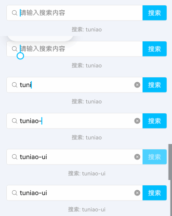
通过 modelValue 绑定输入值,onChange 监听输入变化,onSearch 监听搜索按钮点击或键盘确认。默认显示方形搜索框和搜索按钮。
点我查看代码
typescript
@Local basicValue: string = "";

TnSearchBox({
  modelValue: this.basicValue,
  onChange: (value: string) => {
    this.basicValue = value;
  },
  onSearch: (value: string) => {
    // 处理搜索逻辑
  }
})
圆形搜索框
设置 shape 为 "round" 使用胶囊形状,搜索按钮也会自动跟随圆角。

点我查看代码
typescript
@Local roundValue: string = "";

TnSearchBox({
  modelValue: this.roundValue,
  shape: "round",
  onChange: (value: string) => {
    this.roundValue = value;
  }
})
自定义占位文本
通过 placeholder 设置自定义提示文字。

点我查看代码
typescript
@Local placeholderValue: string = "";

TnSearchBox({
  modelValue: this.placeholderValue,
  placeholder: "搜索商品、店铺",
  onChange: (value: string) => {
    this.placeholderValue = value;
  }
})
禁用状态
设置 disabled 后搜索框不可交互,整体透明度降低。

点我查看代码
typescript
TnSearchBox({
  modelValue: "禁用状态",
  disabled: true
})
无边框
设置 showBorder 为 false 隐藏边框,可搭配 bgColor 设置灰色背景实现另一种视觉风格。

点我查看代码
typescript
@Local noBorderValue: string = "";

TnSearchBox({
  modelValue: this.noBorderValue,
  showBorder: false,
  bgColor: $r("app.color.tn_color_gray_disabled"),
  onChange: (value: string) => {
    this.noBorderValue = value;
  }
})
无搜索按钮
设置 searchButton 为 false 隐藏搜索按钮,此时可通过键盘确认键触发搜索。

点我查看代码
typescript
@Local noButtonValue: string = "";

TnSearchBox({
  modelValue: this.noButtonValue,
  searchButton: false,
  onChange: (value: string) => {
    this.noButtonValue = value;
  }
})
自定义搜索按钮
通过 searchButtonText 自定义按钮文字,searchButtonBgColor 自定义按钮背景色。

点我查看代码
typescript
@Local customButtonValue: string = "";

TnSearchBox({
  modelValue: this.customButtonValue,
  searchButtonText: "查找",
  searchButtonBgColor: getThemeColor(this.baseStyle, "success"),
  shape: "round",
  onChange: (value: string) => {
    this.customButtonValue = value;
  }
})
自定义颜色
通过 inputBorderColor 自定义边框颜色,searchButtonBgColor 自定义搜索按钮背景色。

点我查看代码
typescript
@Local customColorValue: string = "";

TnSearchBox({
  modelValue: this.customColorValue,
  inputBorderColor: getThemeColor(this.baseStyle, "primary"),
  searchButtonBgColor: getThemeColor(this.baseStyle, "warning"),
  onChange: (value: string) => {
    this.customColorValue = value;
  }
})
不同尺寸
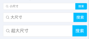
通过 boxSize 设置搜索框尺寸,支持 "sm"、"default"、"lg"、"xl" 四种尺寸。
点我查看代码
typescript
@Local smValue: string = "";
@Local lgValue: string = "";
@Local xlValue: string = "";

// 小尺寸
TnSearchBox({
  modelValue: this.smValue,
  boxSize: "sm",
  placeholder: "小尺寸",
  onChange: (value: string) => {
    this.smValue = value;
  }
})

// 大尺寸
TnSearchBox({
  modelValue: this.lgValue,
  boxSize: "lg",
  placeholder: "大尺寸",
  onChange: (value: string) => {
    this.lgValue = value;
  }
})

// 超大尺寸
TnSearchBox({
  modelValue: this.xlValue,
  boxSize: "xl",
  placeholder: "超大尺寸",
  onChange: (value: string) => {
    this.xlValue = value;
  }
})
清除按钮始终显示
默认情况下清除按钮仅在聚焦且有值时显示。设置 clearTrigger 为 "always" 后,只要有输入值就会显示清除按钮。

点我查看代码
typescript
@Local clearAlwaysValue: string = "可清除内容";

TnSearchBox({
  modelValue: this.clearAlwaysValue,
  clearTrigger: "always",
  onChange: (value: string) => {
    this.clearAlwaysValue = value;
  },
  onClear: () => {
    this.clearAlwaysValue = "";
  }
})
文字居中
设置 textAlign 为 TextAlign.Center 使输入文字和占位文字居中对齐。

点我查看代码
typescript
@Local centerValue: string = "";

TnSearchBox({
  modelValue: this.centerValue,
  textAlign: TextAlign.Center,
  searchButton: false,
  shape: "round",
  onChange: (value: string) => {
    this.centerValue = value;
  }
})
API
Props
| 参数 | 说明 | 类型 | 默认值 |
|---|---|---|---|
| modelValue | 搜索框输入值 | string | "" |
| placeholder | 占位文本 | string | "请输入搜索内容" |
| shape | 搜索框形状 | "square" | "round" | "square" |
| boxSize | 搜索框尺寸 | "sm" | "default" | "lg" | "xl" | "default" |
| textColor | 输入文字颜色 | ResourceColor | 主要文字色 |
| placeholderColor | 占位文字颜色 | ResourceColor | 占位文字色 |
| textAlign | 文字对齐方式 | TextAlign | TextAlign.Start |
| showBorder | 是否显示边框 | boolean | true |
| inputBorderColor | 边框颜色 | ResourceColor | 禁用灰 |
| disabled | 是否禁用 | boolean | false |
| clearable | 是否可清除 | boolean | true |
| clearTrigger | 清除按钮触发方式 | "always" | "focus" | "focus" |
| searchButton | 是否显示搜索按钮 | boolean | true |
| searchButtonText | 搜索按钮文字 | string | "搜索" |
| searchButtonTextColor | 搜索按钮文字颜色 | ResourceColor | 白色 |
| searchButtonBgColor | 搜索按钮背景色 | ResourceColor | 主题色(primary) |
| bgColor | 搜索框背景色 | ResourceColor | 组件默认背景色 |
| focus | 是否自动聚焦 | boolean | false |
Events
| 事件名 | 说明 | 回调参数 |
|---|---|---|
| onChange | 输入值变化时触发 | (value: string) => void |
| onSearch | 搜索按钮点击或键盘确认时触发 | (value: string) => void |
| onClear | 清除按钮点击时触发 | () => void |
| onInputFocus | 输入框聚焦时触发 | () => void |
| onInputBlur | 输入框失焦时触发 | () => void |
| onBoxClick | 点击搜索框时触发(禁用状态下也会触发) | () => void |
类型定义
typescript
/** 搜索框形状 */
type TnSearchBoxShape = "square" | "round";

/** 搜索框尺寸 */
type TnSearchBoxSize = "sm" | "default" | "lg" | "xl";

/** 清除按钮触发方式 */
type TnSearchBoxClearTrigger = "always" | "focus";