Input 输入框
介绍
用于接收用户输入的文本信息,支持文本、数字、密码、文本域等多种输入类型,以及清除、字数统计、前后插槽等功能。
引入
typescript
import { TnInput } from "@tuniao/tn-ui";代码演示
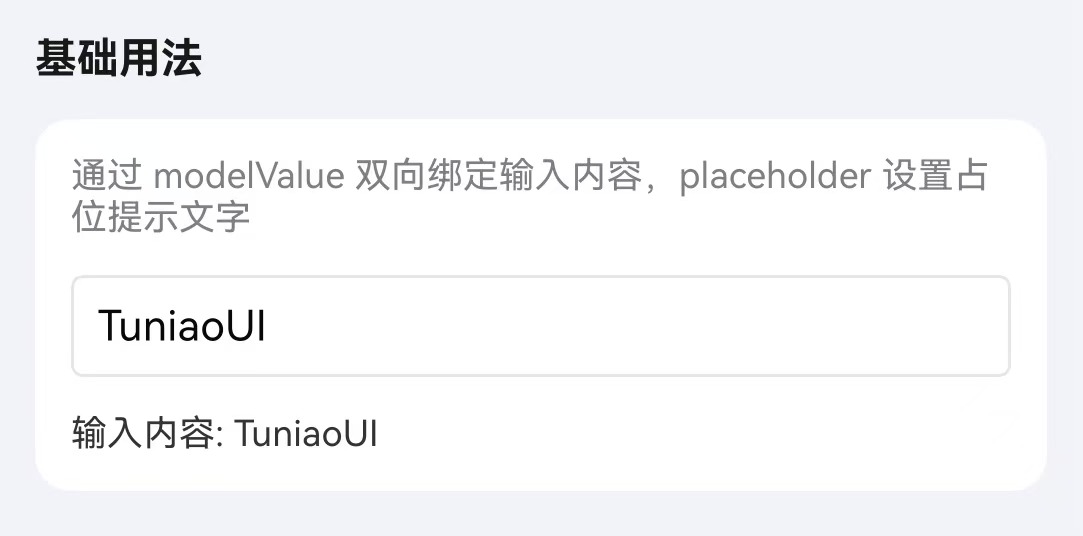
基础用法
通过 modelValue 属性绑定输入值,placeholder 设置占位提示文字。
点我查看代码
typescript
@Local inputValue: string = "";
TnInput({
modelValue: this.inputValue,
placeholder: "请输入内容",
onInput: (value: string) => {
this.inputValue = value;
},
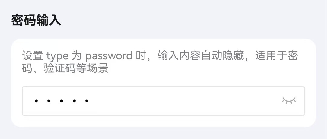
})密码输入
通过设置 type 为 password 开启密码模式,配合 showPassword 属性可切换密码可见性。
点我查看代码
typescript
@Local password: string = "";
TnInput({
modelValue: this.password,
type: "password",
placeholder: "请输入密码",
showPassword: true,
onInput: (value: string) => {
this.password = value;
},
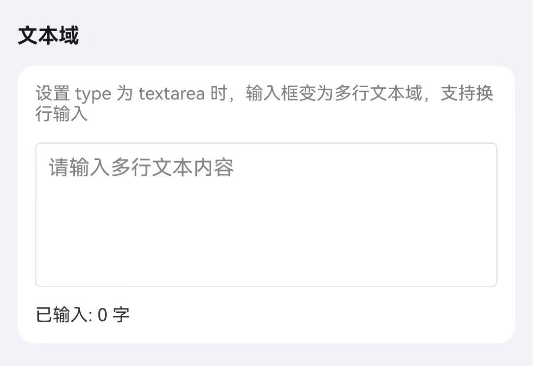
})文本域
通过设置 type 为 textarea 开启文本域模式,配合 autoHeight 可实现自适应高度。
点我查看代码
typescript
@Local content: string = "";
TnInput({
modelValue: this.content,
type: "textarea",
placeholder: "请输入多行文本内容",
autoHeight: true,
onInput: (value: string) => {
this.content = value;
},
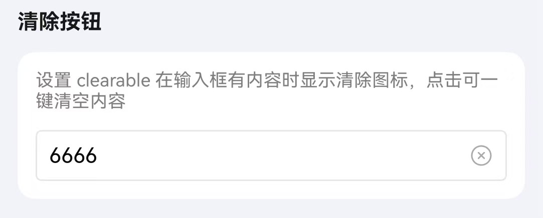
})清除按钮
通过 clearable 属性开启清除按钮,输入内容后显示清除图标。
点我查看代码
typescript
@Local inputValue: string = "可清除内容";
TnInput({
modelValue: this.inputValue,
placeholder: "请输入内容",
clearable: true,
onInput: (value: string) => {
this.inputValue = value;
},
onClear: () => {
this.inputValue = "";
},
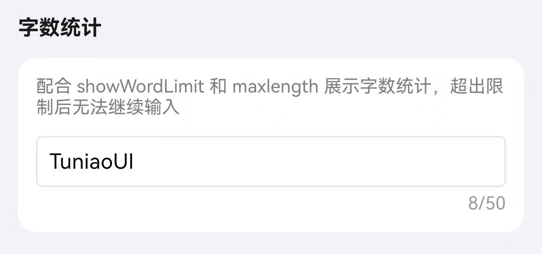
})字数统计
通过 maxlength 设置最大输入长度,配合 showWordLimit 显示字数统计。
点我查看代码
typescript
@Local inputValue: string = "";
TnInput({
modelValue: this.inputValue,
placeholder: "请输入内容",
maxlength: 50,
showWordLimit: true,
onInput: (value: string) => {
this.inputValue = value;
},
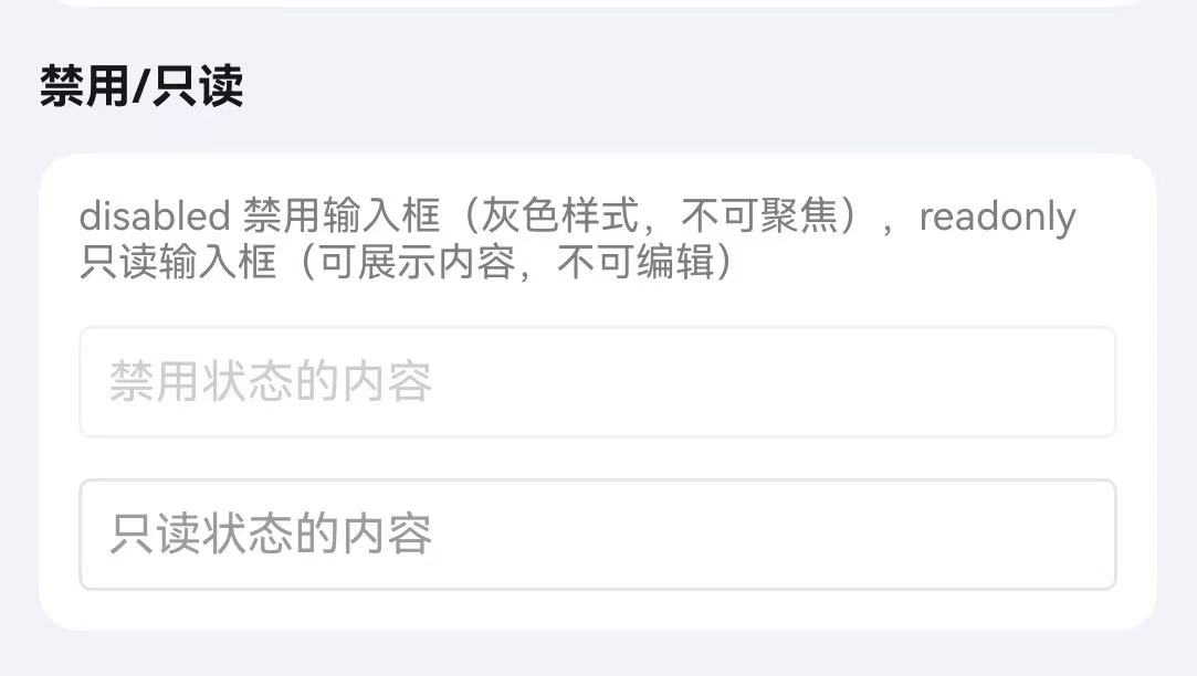
})禁用/只读
通过 disabled 属性禁用输入框,通过 readonly 属性设置为只读状态。
点我查看代码
typescript
Column({ space: 10 }) {
TnInput({
modelValue: "禁用状态",
disabled: true,
})
TnInput({
modelValue: "只读状态",
readonly: true,
})
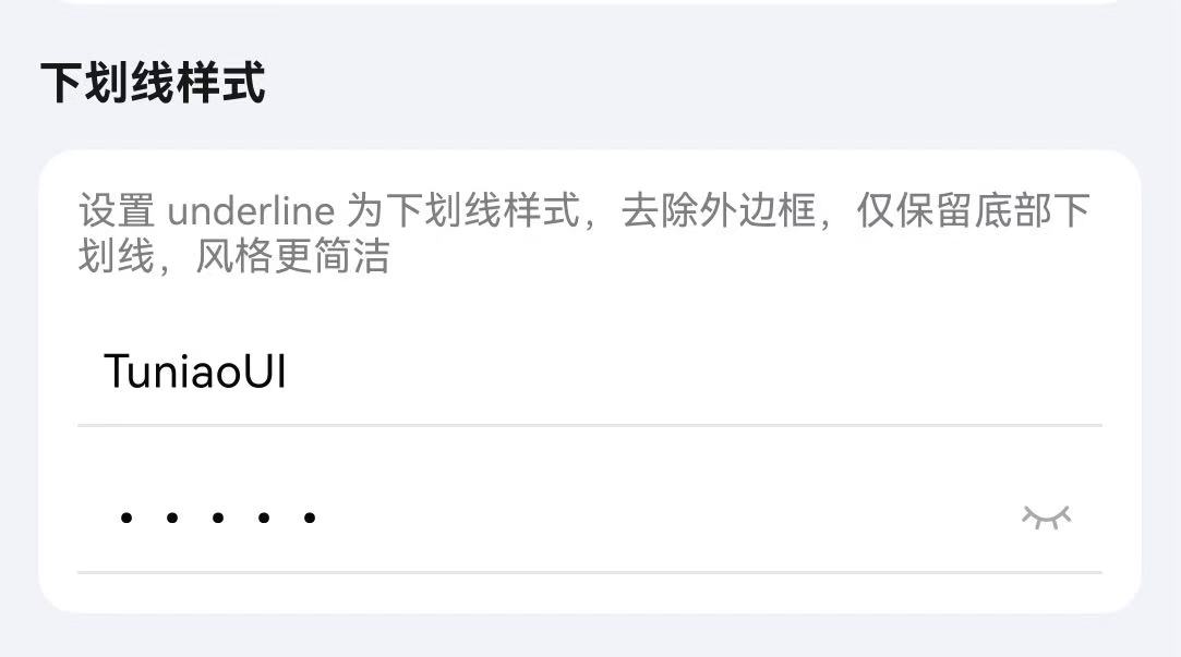
}下划线样式
通过 underline 属性开启下划线样式,通过 showBorder 和 inputBorderColor 属性控制边框样式。
点我查看代码
typescript
@Local inputValue: string = "";
Column({ space: 10 }) {
// 下划线样式
TnInput({
modelValue: this.inputValue,
placeholder: "下划线样式",
underline: true,
onInput: (value: string) => {
this.inputValue = value;
},
})
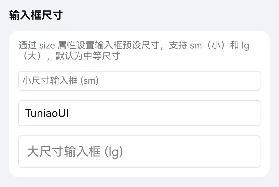
}输入框尺寸
通过 inputSize 属性设置输入框尺寸,可选值为 sm、空字符串(默认)、lg。
点我查看代码
typescript
@Local inputValue: string = "";
Column({ space: 10 }) {
TnInput({
modelValue: this.inputValue,
placeholder: "小尺寸",
inputSize: "sm",
onInput: (value: string) => {
this.inputValue = value;
},
})
TnInput({
modelValue: this.inputValue,
placeholder: "默认尺寸",
onInput: (value: string) => {
this.inputValue = value;
},
})
TnInput({
modelValue: this.inputValue,
placeholder: "大尺寸",
inputSize: "lg",
onInput: (value: string) => {
this.inputValue = value;
},
})
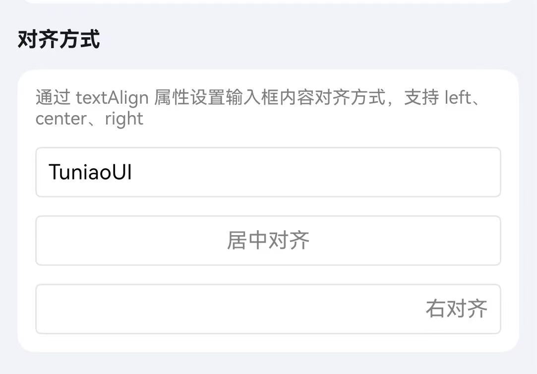
}对齐方式
通过 textAlign 属性设置输入文本的对齐方式。
点我查看代码
typescript
@Local inputValue: string = "";
Column({ space: 10 }) {
TnInput({
modelValue: this.inputValue,
placeholder: "左对齐",
textAlign: "left",
onInput: (value: string) => {
this.inputValue = value;
},
})
TnInput({
modelValue: this.inputValue,
placeholder: "居中对齐",
textAlign: "center",
onInput: (value: string) => {
this.inputValue = value;
},
})
TnInput({
modelValue: this.inputValue,
placeholder: "右对齐",
textAlign: "right",
onInput: (value: string) => {
this.inputValue = value;
},
})
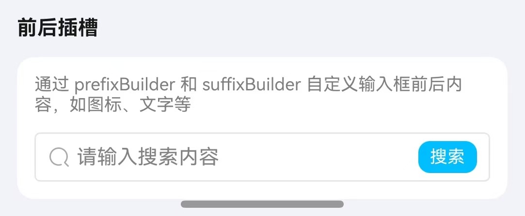
}前后插槽
通过 rightIcon 属性设置右侧图标,也可通过自定义 Builder 实现前后插槽内容。
点我查看代码
typescript
@Local inputValue: string = "";
@Local phoneValue: string = "";

Column({ space: 10 }) {
  TnInput({
    modelValue: this.vm.slotValue,
    placeholder: "请输入搜索内容",
    onInput: (value: string) => {
      this.vm.setSlotValue(value);
    },
    prefixBuilder: (): void => this.PrefixSearchIcon(),
    suffixBuilder: (): void => this.SuffixSearchButton()
  });
}
/**
 * 搜索图标前置插槽
 */
@Builder
private PrefixSearchIcon(): void {
  TnIcon({ name: "search", iconSize: 16, color: $r("app.color.tn_color_gray") })
  .margin({ right: 4 });
}

/**
 * 搜索按钮后置插槽
 */
@Builder
private SuffixSearchButton(): void {
  Text("搜索")
  .fontSize($r("app.float.body_medium"))
  .fontColor($r("app.color.tn_color_white"))
  .backgroundColor($r("app.color.tn_color_primary"))
  .borderRadius($r("app.float.radius_small"))
  .padding({ left: 8, right: 8, top: 4, bottom: 4 })
  .margin({ left: 4 });
}
API
Props
| 参数 | 说明 | 类型 | 默认值 |
|---|---|---|---|
| modelValue | 输入框绑定值 | string | "" |
| type | 输入类型 | "text" | "number" | "password" | "textarea" | "digit" | "idcard" | "text" |
| placeholder | 占位提示文字 | string | "" |
| placeholderColor | 占位文字颜色 | ResourceColor | $r("app.color.tn_text_color_placeholder") |
| disabled | 是否禁用 | boolean | false |
| readonly | 是否只读 | boolean | false |
| clearable | 是否显示清除按钮 | boolean | false |
| showPassword | 是否显示密码切换按钮(password 类型有效) | boolean | true |
| maxlength | 最大输入长度,-1 为不限制 | number | -1 |
| showWordLimit | 是否显示字数统计 | boolean | false |
| autoHeight | 文本域是否自适应高度(textarea 类型有效) | boolean | true |
| showBorder | 是否显示边框 | boolean | true |
| inputBorderColor | 边框颜色 | ResourceColor | $r("app.color.tn_color_gray_disabled") |
| underline | 是否显示下划线 | boolean | false |
| textAlign | 文本对齐方式 | "left" | "center" | "right" | "left" |
| trim | 是否自动去除首尾空格 | boolean | true |
| inputHeight | 自定义高度(vp),0 表示使用默认高度 | number | 0 |
| rightIcon | 右侧图标 | string | "" |
| inputSize | 输入框尺寸 | "sm" | "" | "lg" | "" |
Slots
| 名称 | 说明 |
|---|---|
| prefixBuilder | 输入框前置插槽,通过 @BuilderParam 传入自定义内容(textarea 模式无效) |
| suffixBuilder | 输入框后置插槽,通过 @BuilderParam 传入自定义内容(textarea 模式无效) |
Events
| 事件名 | 说明 | 回调参数 |
|---|---|---|
| onInput | 输入时触发 | (value: string) => void |
| onChange | 值变化时触发 | (value: string) => void |
| onInputFocus | 获取焦点时触发 | () => void |
| onInputBlur | 失去焦点时触发 | () => void |
| onClear | 点击清除按钮时触发 | () => void |
| onConfirm | 点击确认按钮时触发 | (value: string) => void |
| onInputClick | 点击输入框时触发 | () => void |