Popup 弹出层
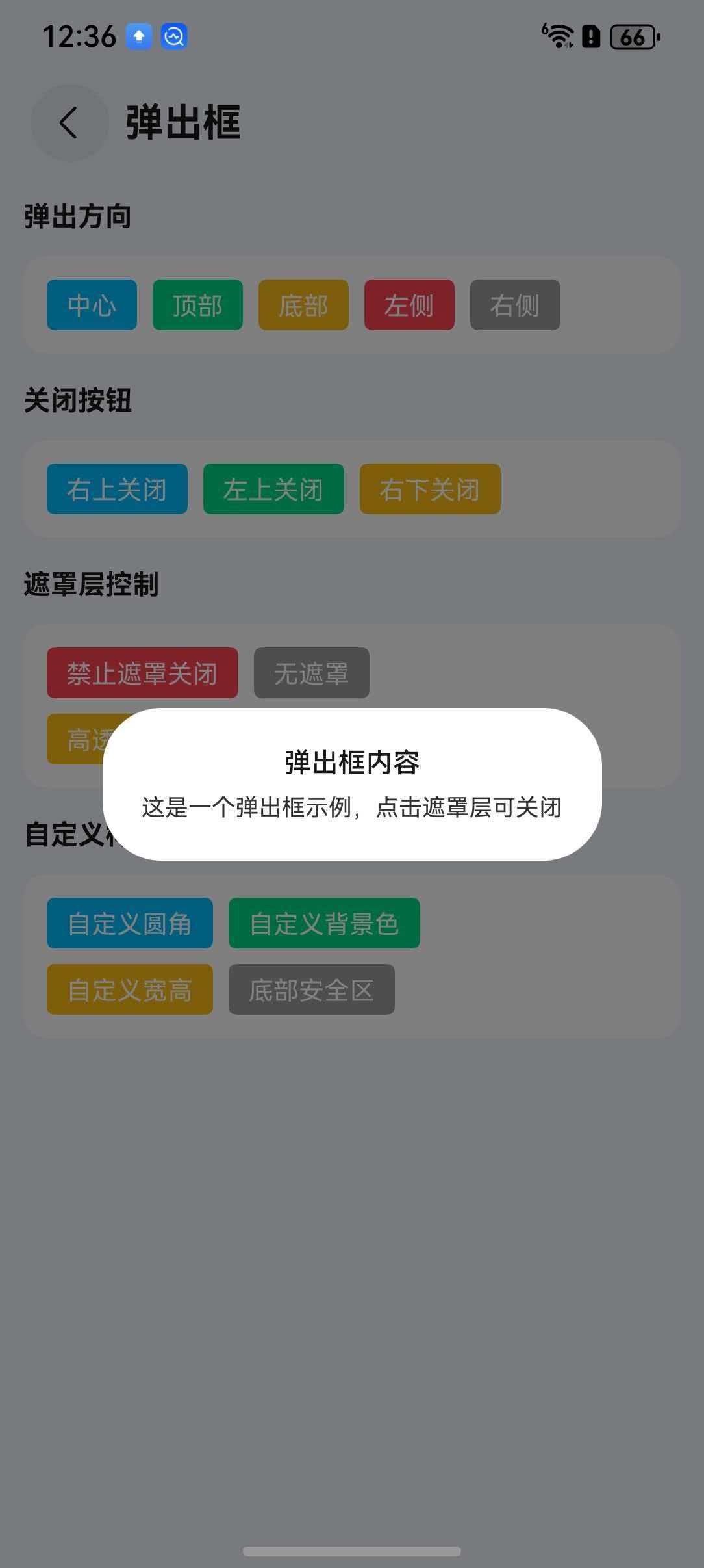
介绍
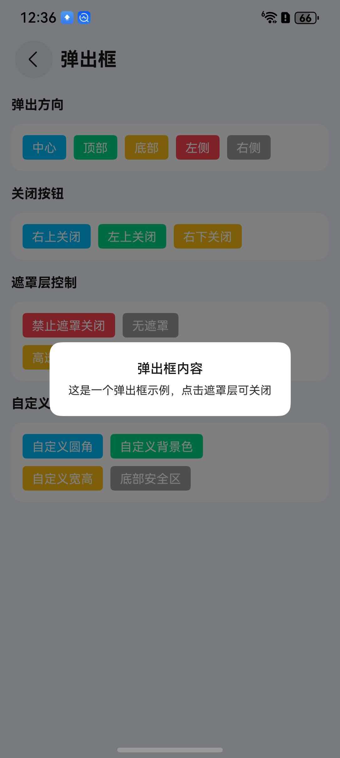
弹出层容器,用于展示弹窗、信息提示等内容,支持多种弹出方向和自定义内容。
引入
typescript
import { TnPopup } from "@tuniao/tn-ui";代码演示
基础用法
通过 visible 控制弹出层的显示与隐藏,使用 contentBuilder 传入自定义内容。
点我查看代码
typescript
import { TnPopup } from "@tuniao/tn-ui";
@Entry
@ComponentV2
struct PopupBasic {
@Local visible: boolean = false;
@Builder
popupContent() {
Column() {
Text("弹出层内容")
.padding(20)
}
}
build() {
Column() {
Button("打开弹出层")
.onClick(() => {
this.visible = true;
})
TnPopup({
visible: this.visible,
contentBuilder: () => {
this.popupContent();
},
$visible: (visible: boolean) => {
this.visible = visible;
},
})
}
}
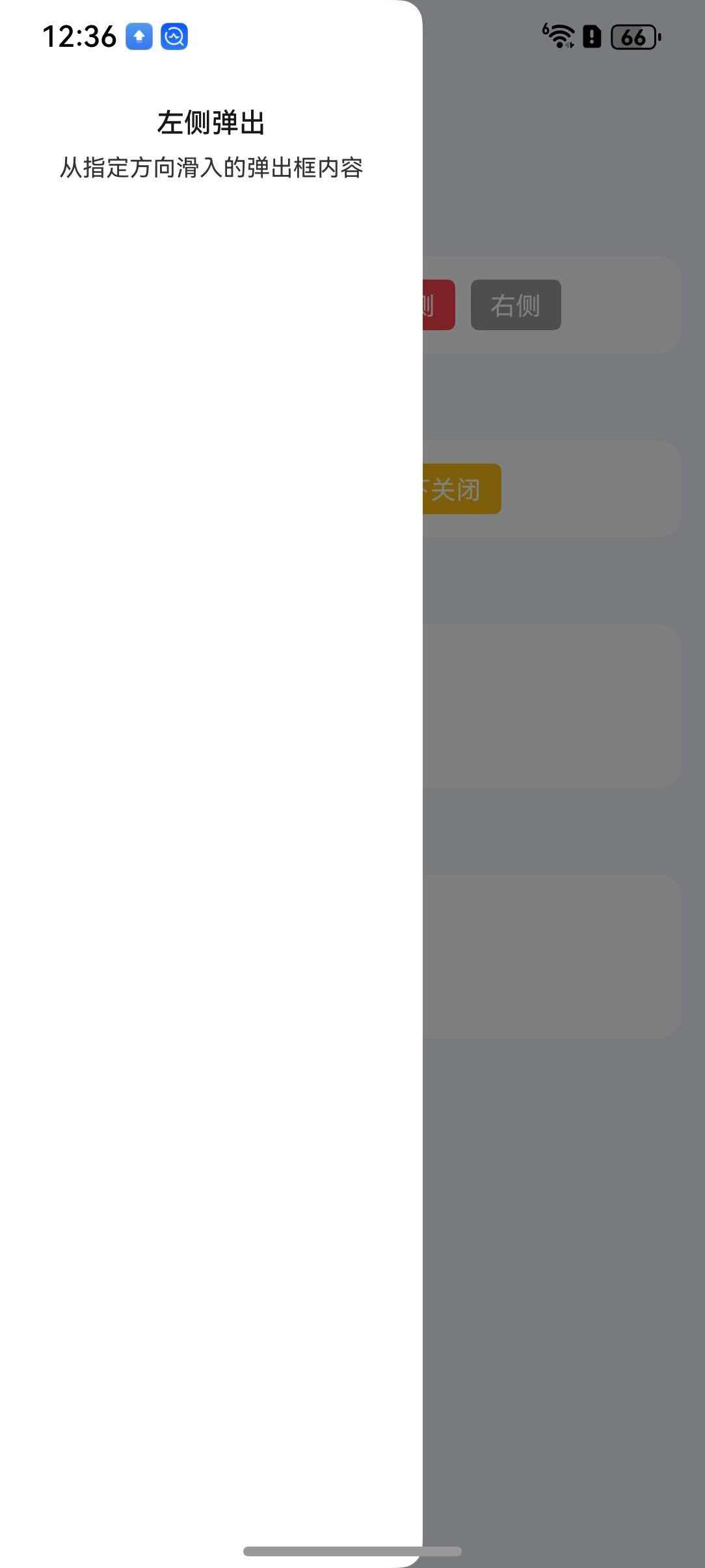
}弹出方向
通过 openDirection 属性设置弹出方向,支持 "center"、"top"、"bottom"、"left"、"right" 五种方向。
点我查看代码
typescript
// 底部弹出
TnPopup({
  visible: this.visible,
  openDirection: "bottom",
  contentBuilder: () => {
    this.popupContent();
  },
  $visible: (visible: boolean) => {
    this.visible = visible;
  },
})

// 左侧弹出
TnPopup({
  visible: this.visibleLeft,
  openDirection: "left",
  contentBuilder: () => {
    this.popupContent();
  },
  $visible: (visible: boolean) => {
    this.visibleLeft = visible;
  },
})

// 顶部弹出
TnPopup({
  visible: this.visibleTop,
  openDirection: "top",
  contentBuilder: () => {
    this.popupContent();
  },
  $visible: (visible: boolean) => {
    this.visibleTop = visible;
  },
})

// 右侧弹出
TnPopup({
  visible: this.visibleRight,
  openDirection: "right",
  contentBuilder: () => {
    this.popupContent();
  },
  $visible: (visible: boolean) => {
    this.visibleRight = visible;
  },
})
关闭按钮
通过 closeBtn 属性显示关闭按钮,closeBtnPosition 控制按钮位置。
点我查看代码
typescript
TnPopup({
visible: this.visible,
openDirection: "bottom",
closeBtn: true,
closeBtnPosition: "right-top",
contentBuilder: () => {
this.popupContent();
},
$visible: (visible: boolean) => {
this.visible = visible;
},
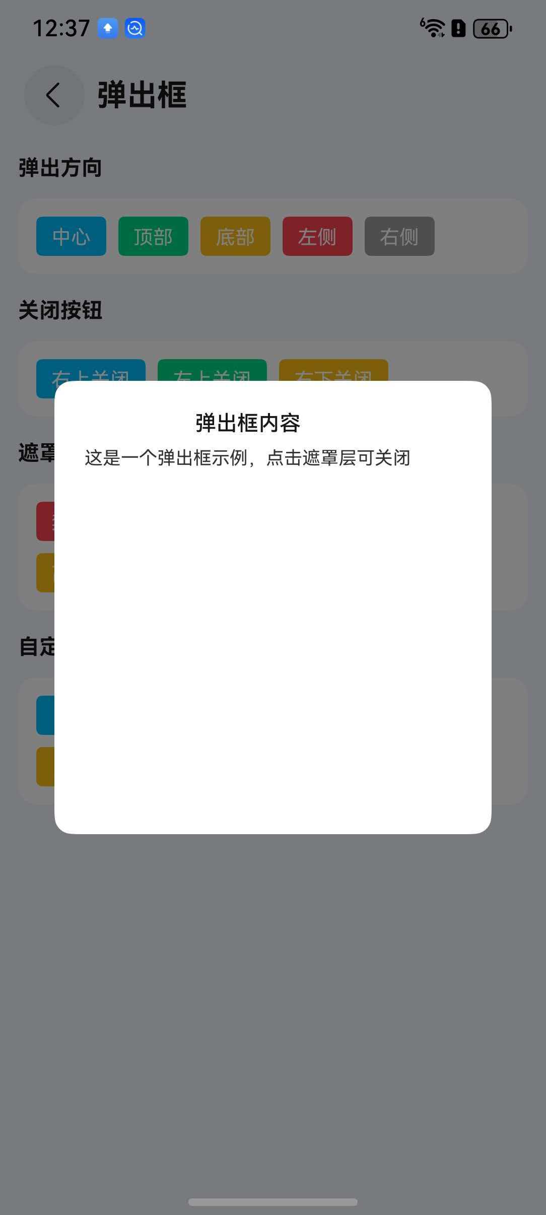
})自定义尺寸
通过 popupWidth 和 popupHeight 属性设置弹出层的宽高。
点我查看代码
typescript
TnPopup({
  visible: this.visible,
  openDirection: "center",
  popupWidth: "80%",
  popupHeight: 300,
  contentBuilder: () => {
    this.popupContent();
  },
  $visible: (visible: boolean) => {
    this.visible = visible;
  },
})
圆角
通过 radius 属性设置弹出层圆角。
点我查看代码
typescript
TnPopup({
visible: this.visible,
openDirection: "bottom",
radius: 16,
contentBuilder: () => {
this.popupContent();
},
$visible: (visible: boolean) => {
this.visible = visible;
},
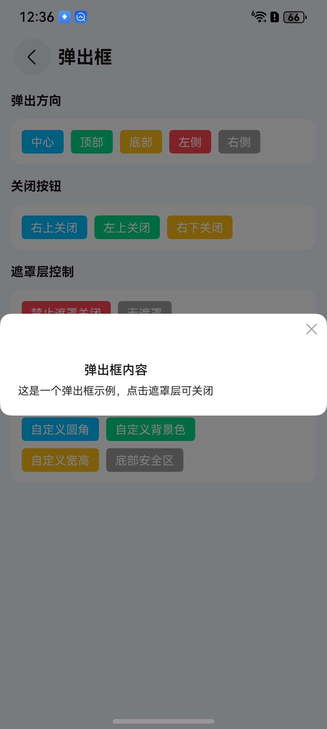
})遮罩层设置
通过 showOverlay 控制是否显示遮罩层,overlayOpacity 设置遮罩层透明度,overlayCloseable 控制点击遮罩层是否关闭。

点我查看代码
typescript
// 自定义遮罩层透明度
TnPopup({
  visible: this.visible,
  openDirection: "center",
  showOverlay: true,
  overlayOpacity: 0.7,
  overlayCloseable: false,
  closeBtn: true,
  contentBuilder: () => {
    this.popupContent();
  },
  $visible: (visible: boolean) => {
    this.visible = visible;
  },
})
API
Props
| 参数 | 说明 | 类型 | 默认值 |
|---|---|---|---|
| visible | 是否显示弹出层 | boolean | false |
| openDirection | 弹出方向 | "center" | "top" | "bottom" | "left" | "right" | "center" |
| popupWidth | 弹出层宽度 | TnStringNumber | - |
| popupHeight | 弹出层高度 | TnStringNumber | - |
| bgColor | 背景色 | ResourceColor | - |
| radius | 圆角大小 | TnStringNumber | - |
| showOverlay | 是否显示遮罩层 | boolean | true |
| overlayOpacity | 遮罩层透明度 | number | 0.5 |
| overlayCloseable | 点击遮罩层是否关闭 | boolean | true |
| closeBtn | 是否显示关闭按钮 | boolean | false |
| closeBtnPosition | 关闭按钮位置 | "left-top" | "right-top" | "left-bottom" | "right-bottom" | "right-top" |
| safeAreaInsetBottom | 是否适配底部安全区 | boolean | true |
| top | 顶部偏移距离 | TnStringNumber | - |
| closeOnBackPress | 返回键是否关闭 | boolean | true |
BuilderParams
| 参数 | 说明 | 类型 |
|---|---|---|
| contentBuilder | 自定义内容构建器 | CustomBuilder |
| closeBtnBuilder | 自定义关闭按钮构建器 | CustomBuilder |
Events
| 事件名 | 说明 | 回调参数 |
|---|---|---|
| onOpen | 弹出层打开时触发 | () => void |
| onClose | 弹出层关闭时触发 | () => void |
| onOverlayClick | 点击遮罩层时触发 | () => void |
| $visible | 弹出层显示状态变化(双向绑定) | (visible: boolean) => void |