Progress 进度条
介绍
用于展示操作或任务的当前进度,提供线形和圆形两种样式。由 TnLineProgress 和 TnCircleProgress 两个组件组成,支持主题色、自定义颜色、进度文字、格式化文本及动画过渡。
引入
typescript
import { TnLineProgress, TnCircleProgress } from "@tuniao/tn-ui";代码演示
线形进度条 - 基础用法
通过 percent 属性设置当前进度值,取值范围 0-100。

点我查看代码
typescript
TnLineProgress({ percent: 30 });显示进度文字
设置 showPercent 为 true,在进度条右侧显示百分比文字。

点我查看代码
typescript
TnLineProgress({ percent: 50, showPercent: true });文字在内部
设置 textInside 为 true,将进度文字显示在进度条内部。建议同时增大 barHeight 以确保文字可见。

点我查看代码
typescript
TnLineProgress({
  percent: 70,
  showPercent: true,
  textInside: true,
  barHeight: 20
});
自定义颜色
通过 activeColor 属性设置进度条颜色,支持主题色名称(如 "success"、"warning"、"danger")或自定义颜色值。通过 inactiveColor 设置未激活区域的颜色。

点我查看代码
typescript
Column() {
  TnLineProgress({ percent: 60, activeColor: "success", showPercent: true });
  TnLineProgress({ percent: 60, activeColor: "warning", showPercent: true });
  TnLineProgress({ percent: 60, activeColor: "danger", showPercent: true });
  TnLineProgress({
    percent: 60,
    activeColor: "#01beff",
    inactiveColor: "rgba(1, 190, 255, 0.2)",
    showPercent: true
  });
}
自定义格式化文本
通过 format 属性传入一个函数,自定义进度文字的显示内容。

点我查看代码
typescript
TnLineProgress({
  percent: 80,
  showPercent: true,
  format: (p: number): string => {
    if (p >= 100) {
      return "已完成";
    }
    return `${p}/100`;
  }
});
不同高度
通过 barHeight 属性设置进度条高度,单位 vp。

点我查看代码
typescript
Column() {
  TnLineProgress({ percent: 40, barHeight: 4 });
  TnLineProgress({ percent: 60, barHeight: 12 });
  TnLineProgress({ percent: 80, barHeight: 24 });
}
动态控制
通过动态修改 percent 值来控制进度,配合 onComplete 事件监听进度完成。

点我查看代码
typescript
@Local percent: number = 0;

Column() {
  TnLineProgress({
    percent: this.percent,
    showPercent: true,
    barHeight: 16,
    onComplete: () => {
      // 进度到达 100 时触发
    }
  });
  Row({ space: this.baseStyle.spaceMd }) {
    TnButton({
      content: "- 10",
      btnSize: "sm",
      type: "danger",
      onBtnClick: () => { this.percent = Math.max(0, this.percent - 10); }
    });
    TnButton({
      content: "+ 10",
      btnSize: "sm",
      type: "primary",
      onBtnClick: () => { this.percent = Math.min(100, this.percent + 10); }
    });
    TnButton({
      content: "重置",
      btnSize: "sm",
      type: "info",
      onBtnClick: () => { this.percent = 0; }
    });
  }
}
圆形进度条 - 基础用法
使用 TnCircleProgress 组件展示圆形进度条,默认显示进度文字。
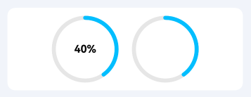
点我查看代码
typescript
Row({ space: this.baseStyle.spaceLg }) {
  TnCircleProgress({ percent: 40 });
  TnCircleProgress({ percent: 40, showPercent: false });
}
圆形进度条 - 自定义颜色
通过 activeColor 设置圆形进度条的进度颜色,支持主题色名称。
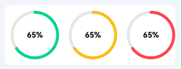
点我查看代码
typescript
Row({ space: this.baseStyle.spaceLg }) {
  TnCircleProgress({ percent: 65, activeColor: "success" });
  TnCircleProgress({ percent: 65, activeColor: "warning" });
  TnCircleProgress({ percent: 65, activeColor: "danger" });
}
圆形进度条 - 自定义尺寸
通过 radius 设置圆的半径,通过 ringWidth 设置圆环宽度。
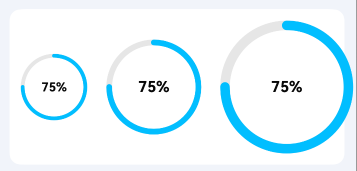
点我查看代码
typescript
Row({ space: this.baseStyle.spaceLg }) {
  TnCircleProgress({ percent: 75, radius: 35, ringWidth: 4 });
  TnCircleProgress({ percent: 75, radius: 50, ringWidth: 6 });
  TnCircleProgress({ percent: 75, radius: 70, ringWidth: 10 });
}
圆形进度条 - 自定义格式化文本
通过 format 属性自定义圆形进度条中间显示的文字。
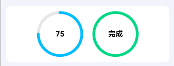
点我查看代码
typescript
Row({ space: this.baseStyle.spaceLg }) {
  TnCircleProgress({
    percent: 75,
    format: (p: number): string => {
      if (p >= 100) return "满";
      return `${p}`;
    }
  });
  TnCircleProgress({
    percent: 100,
    activeColor: "success",
    format: (_p: number): string => "完成"
  });
}
圆形进度条 - 动态控制
动态修改圆形进度条的进度值。
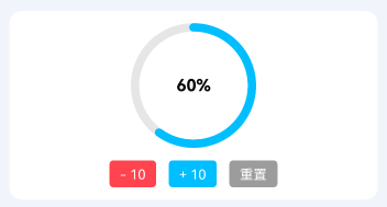
点我查看代码
typescript
@Local circlePercent: number = 0;

Column() {
  TnCircleProgress({
    percent: this.circlePercent,
    radius: 60,
    ringWidth: 8,
    activeColor: "primary"
  });
  Row({ space: this.baseStyle.spaceMd }) {
    TnButton({
      content: "- 10",
      btnSize: "sm",
      type: "danger",
      onBtnClick: () => { this.circlePercent = Math.max(0, this.circlePercent - 10); }
    });
    TnButton({
      content: "+ 10",
      btnSize: "sm",
      type: "primary",
      onBtnClick: () => { this.circlePercent = Math.min(100, this.circlePercent + 10); }
    });
    TnButton({
      content: "重置",
      btnSize: "sm",
      type: "info",
      onBtnClick: () => { this.circlePercent = 0; }
    });
  }
}
API
TnLineProgress Props
| 参数 | 说明 | 类型 | 默认值 |
|---|---|---|---|
| percent | 当前进度百分比 | number | 0 |
| activeColor | 激活时的颜色,支持主题色名称("primary" "success" "warning" "danger" "info")或自定义颜色值 | string | "" |
| inactiveColor | 未激活时的颜色 | string | "" |
| showPercent | 是否显示进度文字 | boolean | false |
| textInside | 进度文字显示在进度条内部 | boolean | false |
| barHeight | 进度条高度(vp) | number | 12 |
| duration | 动画执行时间(ms),0 表示使用主题默认值 | number | 0 |
| format | 自定义格式化进度文本的函数 | (percent: number) => string | - |
TnLineProgress Events
| 事件名 | 说明 | 回调参数 |
|---|---|---|
| onComplete | 进度到达 100 时触发 | - |
TnCircleProgress Props
| 参数 | 说明 | 类型 | 默认值 |
|---|---|---|---|
| percent | 当前进度百分比 | number | 0 |
| activeColor | 激活时的颜色,支持主题色名称("primary" "success" "warning" "danger" "info")或自定义颜色值 | string | "" |
| inactiveColor | 未激活时的颜色 | string | "" |
| showPercent | 是否显示进度文字 | boolean | true |
| radius | 圆的半径(vp) | number | 50 |
| ringWidth | 圆环宽度(vp) | number | 6 |
| duration | 动画执行时间(ms),0 表示使用主题默认值 | number | 0 |
| format | 自定义格式化进度文本的函数 | (percent: number) => string | - |
TnCircleProgress Events
| 事件名 | 说明 | 回调参数 |
|---|---|---|
| onComplete | 进度到达 100 时触发 | - |
主题色名称
activeColor 支持以下主题色名称,使用时直接传入字符串即可:
| 名称 | 说明 |
|---|---|
"primary" | 主色(默认) |
"success" | 成功色 |
"warning" | 警告色 |
"danger" | 危险色 |
"info" | 信息色 |