List 列表
介绍
通用列表组件,由 TnList 和 TnListItem 组合使用,支持分组标题、描述信息、卡片模式、右侧图标、自定义内容插槽等功能。
引入
typescript
import { TnList, TnListItem } from "@tuniao/tn-ui";代码演示
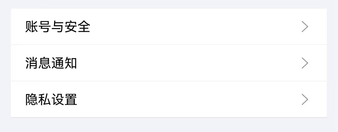
基础用法
TnList 作为容器,TnListItem 作为列表项,通过 title 设置文本。
点我查看代码
typescript
import { TnList, TnListItem } from "@tuniao/tn-ui";
@Entry
@ComponentV2
struct ListBasic {
build() {
Column() {
TnList() {
TnListItem({ title: "账号与安全", bottomBorder: true });
TnListItem({ title: "消息通知", bottomBorder: true });
TnListItem({ title: "隐私设置" });
}
}
}
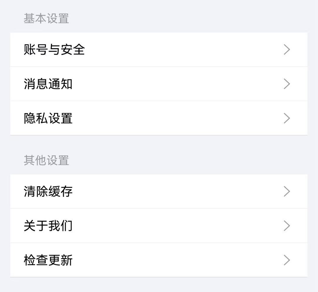
}分组标题
通过 TnList 的 title 和 description 属性设置分组标题和描述。
点我查看代码
typescript
TnList({ title: "基本设置" }) {
TnListItem({ title: "账号与安全", rightIcon: "right", bottomBorder: true });
TnListItem({ title: "消息通知", rightIcon: "right", bottomBorder: true });
TnListItem({ title: "隐私设置", rightIcon: "right" });
}
TnList({ title: "其他设置" }) {
TnListItem({ title: "清除缓存", rightIcon: "right", bottomBorder: true });
TnListItem({ title: "关于我们", rightIcon: "right", bottomBorder: true });
TnListItem({ title: "检查更新", rightIcon: "right" });
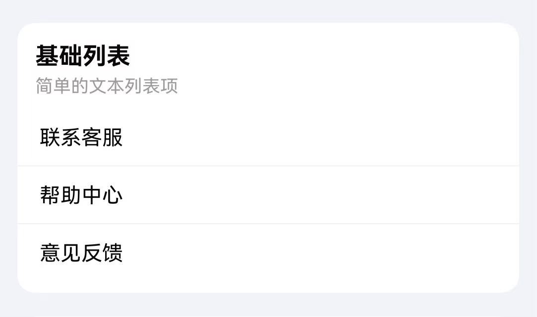
}卡片模式
通过 card 属性启用卡片模式,列表带有圆角和背景色效果。
点我查看代码
typescript
TnList({ title: "基础列表", description: "简单的文本列表项", card: true }) {
TnListItem({ title: "联系客服", bottomBorder: true });
TnListItem({ title: "帮助中心", bottomBorder: true });
TnListItem({ title: "意见反馈" });
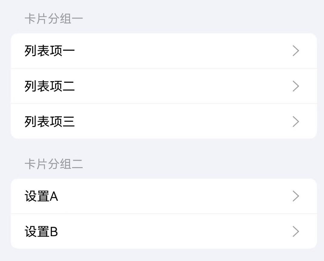
}缩进卡片
通过 inset 属性设置缩进卡片模式,列表两侧留有间距。
点我查看代码
typescript
TnList({ title: "卡片分组一", inset: true }) {
  TnListItem({ title: "列表项一", rightIcon: "right", bottomBorder: true });
  TnListItem({ title: "列表项二", rightIcon: "right", bottomBorder: true });
  TnListItem({ title: "列表项三", rightIcon: "right" });
}

TnList({ title: "卡片分组二", inset: true }) {
  TnListItem({ title: "设置A", rightIcon: "right", bottomBorder: true });
  TnListItem({ title: "设置B", rightIcon: "right" });
}
右侧图标与描述
通过 rightIcon 属性设置列表项右侧图标,description 设置描述文本。
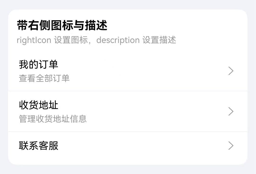
点我查看代码
typescript
TnList({ title: "带右侧图标与描述", description: "rightIcon 设置图标,description 设置描述", card: true }) {
TnListItem({
title: "我的订单",
description: "查看全部订单",
rightIcon: "right",
bottomBorder: true
});
TnListItem({
title: "收货地址",
description: "管理收货地址信息",
rightIcon: "right",
bottomBorder: true
});
TnListItem({ title: "联系客服", rightIcon: "right" });
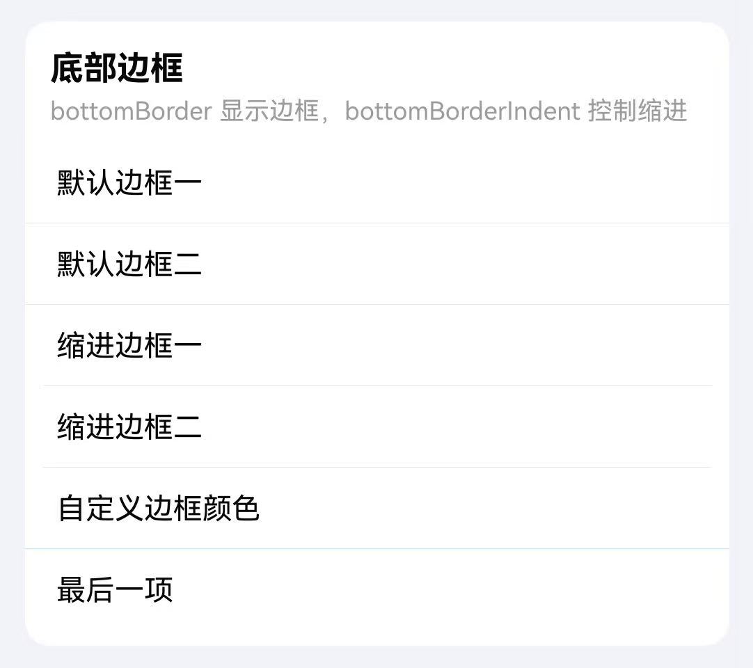
}底部边框
通过 bottomBorder 显示底部分割线,bottomBorderIndent 控制分割线缩进,dividerColor 自定义分割线颜色。
点我查看代码
typescript
TnList({ title: "底部边框", description: "bottomBorder 显示边框,bottomBorderIndent 控制缩进", card: true }) {
  TnListItem({ title: "默认边框一", bottomBorder: true });
  TnListItem({ title: "默认边框二", bottomBorder: true });
  TnListItem({ title: "缩进边框一", bottomBorder: true, bottomBorderIndent: true });
  TnListItem({ title: "缩进边框二", bottomBorder: true, bottomBorderIndent: true });
  TnListItem({
    title: "自定义边框颜色",
    bottomBorder: true,
    dividerColor: $r("app.color.tn_color_primary_light_7")
  });
  TnListItem({ title: "最后一项" });
}
圆角列表项
通过 radius 属性为单个列表项设置圆角效果。
点我查看代码
typescript
TnList({ title: "圆角列表项", description: "使用 radius 显示圆角", card: true }) {
Column({ space: 8 }) {
TnListItem({ title: "圆角列表项一", radius: true, rightIcon: "right" });
TnListItem({ title: "圆角列表项二", radius: true, rightIcon: "right" });
TnListItem({ title: "圆角列表项三", radius: true, rightIcon: "right" });
}
.width("100%")
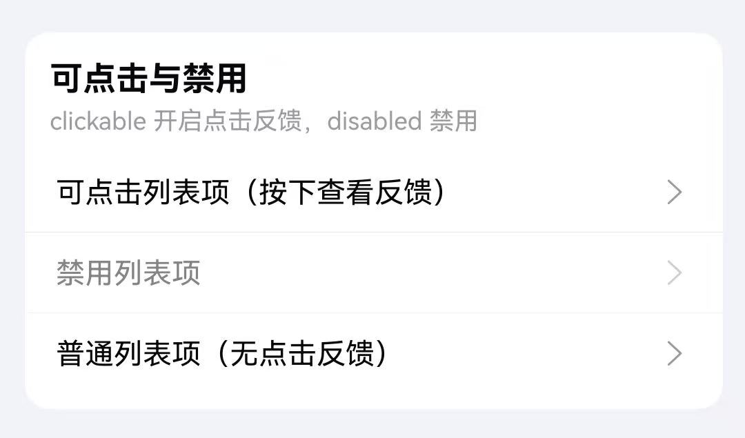
}点击事件与禁用
通过 clickable 属性开启点击反馈效果,disabled 属性设置禁用状态,配合 onItemClick 事件处理点击。
点我查看代码
typescript
TnList({ title: "可点击与禁用", description: "clickable 开启点击反馈,disabled 禁用", card: true }) {
TnListItem({
title: "可点击列表项(按下查看反馈)",
clickable: true,
rightIcon: "right",
bottomBorder: true
});
TnListItem({
title: "禁用列表项",
disabled: true,
rightIcon: "right",
bottomBorder: true
});
TnListItem({
title: "普通列表项(无点击反馈)",
rightIcon: "right"
});
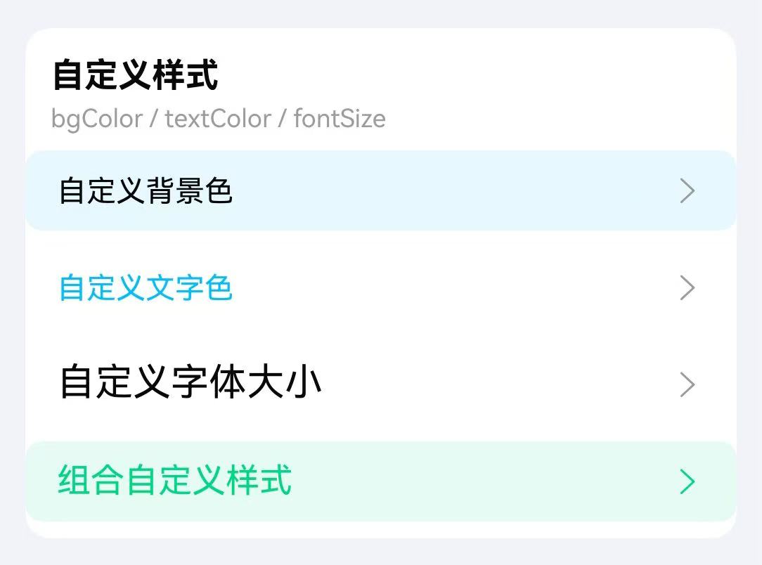
}自定义样式
通过 bgColor、textColor、fontSize、rightIconColor 等属性自定义列表项样式。
点我查看代码
typescript
TnList({ title: "自定义样式", description: "bgColor / textColor / fontSize", card: true }) {
Column({ space: 8 }) {
TnListItem({
title: "自定义背景色",
bgColor: $r("app.color.tn_color_primary_light_9"),
rightIcon: "right",
radius: true
});
TnListItem({
title: "自定义文字色",
textColor: $r("app.color.tn_color_primary"),
rightIcon: "right",
radius: true
});
TnListItem({
title: "自定义字体大小",
fontSize: 18,
rightIcon: "right",
radius: true
});
TnListItem({
title: "组合自定义样式",
bgColor: $r("app.color.tn_color_success_light_9"),
textColor: $r("app.color.tn_color_success"),
fontSize: 16,
rightIcon: "right",
rightIconColor: $r("app.color.tn_color_success"),
radius: true
});
}
.width("100%")
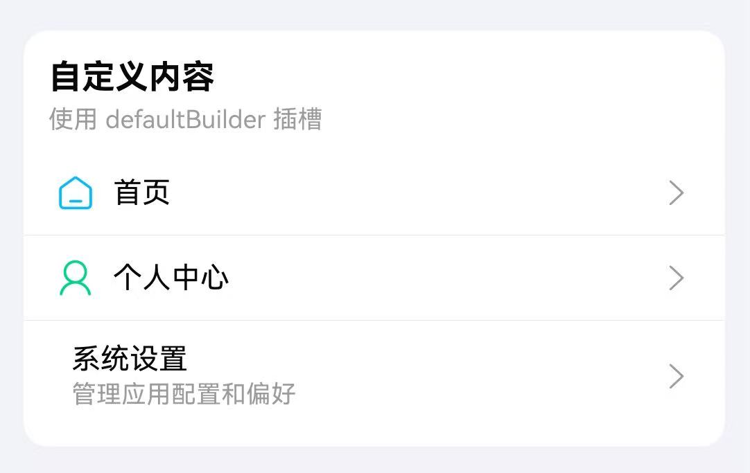
}自定义内容(插槽)
TnListItem 支持通过尾随闭包传入自定义内容,替代默认的 title + description 布局。自定义内容的优先级高于 title 属性。
点我查看代码
typescript
import { TnList, TnListItem, TnIcon } from "@tuniao/tn-ui";

TnList({ title: "自定义内容", description: "使用 defaultBuilder 插槽", card: true }) {
  TnListItem({ rightIcon: "right", bottomBorder: true }) {
    Row({ space: 8 }) {
      TnIcon({ name: "home", iconSize: 20, color: $r("app.color.tn_color_primary") });
      Text("首页")
        .fontSize(14)
        .fontColor($r("app.color.tn_text_color_primary"));
    }
  }

  TnListItem({ rightIcon: "right", bottomBorder: true }) {
    Row({ space: 8 }) {
      TnIcon({ name: "my", iconSize: 20, color: $r("app.color.tn_color_success") });
      Text("个人中心")
        .fontSize(14)
        .fontColor($r("app.color.tn_text_color_primary"));
    }
  }

  TnListItem({ rightIcon: "right" }) {
    Row({ space: 8 }) {
      TnIcon({ name: "setting", iconSize: 20, color: $r("app.color.tn_color_warning") });
      Column({ space: 2 }) {
        Text("系统设置")
          .fontSize(14)
          .fontColor($r("app.color.tn_text_color_primary"));
        Text("管理应用配置和偏好")
          .fontSize(12)
          .fontColor($r("app.color.tn_text_color_secondary"));
      }
      .alignItems(HorizontalAlign.Start);
    }
  }
}
API
TnList Props
| 参数 | 说明 | 类型 | 默认值 |
|---|---|---|---|
| title | 分组标题 | ResourceStr | - |
| description | 分组描述 | ResourceStr | - |
| card | 卡片模式 | boolean | false |
| inset | 缩进卡片模式 | boolean | false |
| hasBorder | 是否显示边框 | boolean | true |
| radius | 圆角大小(card / inset 模式有效) | Length | - |
| titleFontWeight | 标题字重 | FontWeight | Normal(card 模式下默认 Bold) |
| titlePadding | 标题内边距 | Padding | Length | - |
| outerMargin | 外边距(inset 模式有效) | Padding | Length | - |
TnList Slots
| 名称 | 说明 |
|---|---|
| default | 默认内容插槽,用于放置 TnListItem 列表项 |
TnListItem Props
| 参数 | 说明 | 类型 | 默认值 |
|---|---|---|---|
| title | 列表项标题 | ResourceStr | - |
| description | 列表项描述 | ResourceStr | - |
| fontSize | 字体大小 | number | string | - |
| bgColor | 背景色 | ResourceColor | - |
| textColor | 文字颜色 | ResourceColor | - |
| rightIcon | 右侧图标名称 | string | - |
| rightIconColor | 右侧图标颜色 | ResourceColor | - |
| rightIconSize | 右侧图标大小 | number | string | - |
| radius | 是否显示圆角 | boolean | false |
| bottomBorder | 是否显示底部分割线 | boolean | false |
| bottomBorderIndent | 分割线是否缩进 | boolean | false |
| dividerColor | 分割线颜色 | ResourceColor | - |
| clickable | 是否可点击(开启按压反馈) | boolean | false |
| disabled | 是否禁用 | boolean | false |
| listPadding | 列表项内边距 | Padding | Length | - |
TnListItem Slots
| 名称 | 说明 |
|---|---|
| default | 自定义内容插槽,优先级高于 title。通过尾随闭包传入自定义 UI 内容 |
TnListItem Events
| 事件名 | 说明 | 回调参数 |
|---|---|---|
| onItemClick | 点击列表项时触发 | () => void |