Badge 徽标
介绍
在右上角展示徽标数字或圆点,用于消息提醒或状态标记。
引入
typescript
import { TnBadge } from "@tuniao/tn-ui";代码演示
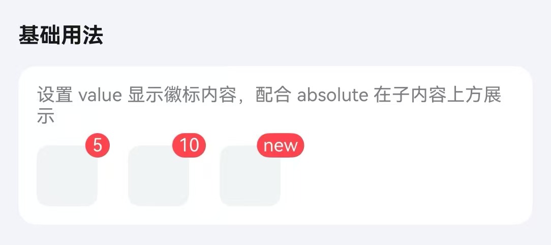
基础用法
通过 value 属性设置徽标内容。
点我查看代码
typescript
/**
* 徽标演示用内容块构建器
*/
@Builder
function BadgeDemoBlock() {
Row()
.width(40)
.height(40)
.borderRadius(8)
.backgroundColor("#f2f3f5");
}
Row({ space: 20 }) {
TnBadge({ value: 5, absolute: true }) {
BadgeDemoBlock();
};
TnBadge({ value: 10, absolute: true }) {
BadgeDemoBlock();
};
TnBadge({ value: "new", absolute: true }) {
BadgeDemoBlock();
};
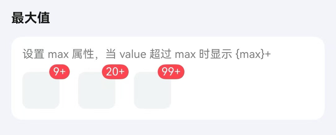
}最大值
通过 max 属性设置最大值,超过时显示 {max}+。
点我查看代码
typescript
Row({ space: 20 }) {
TnBadge({ value: 20, max: 9, absolute: true }) {
BadgeDemoBlock();
};
TnBadge({ value: 50, max: 20, absolute: true }) {
BadgeDemoBlock();
};
TnBadge({ value: 200, max: 99, absolute: true }) {
BadgeDemoBlock();
};
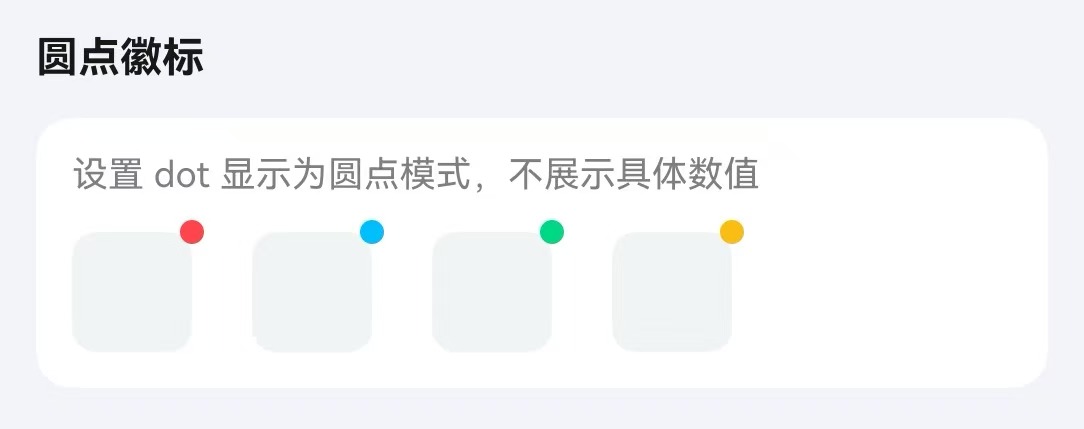
}圆点模式
通过 dot 属性以圆点形式展示。
点我查看代码
typescript
TnBadge({ dot: true, absolute: true }) {
BadgeDemoBlock();
};
TnBadge({ dot: true, absolute: true, type: "primary" }) {
BadgeDemoBlock();
};
TnBadge({ dot: true, absolute: true, type: "success" }) {
BadgeDemoBlock();
};
TnBadge({ dot: true, absolute: true, type: "warning" }) {
BadgeDemoBlock();
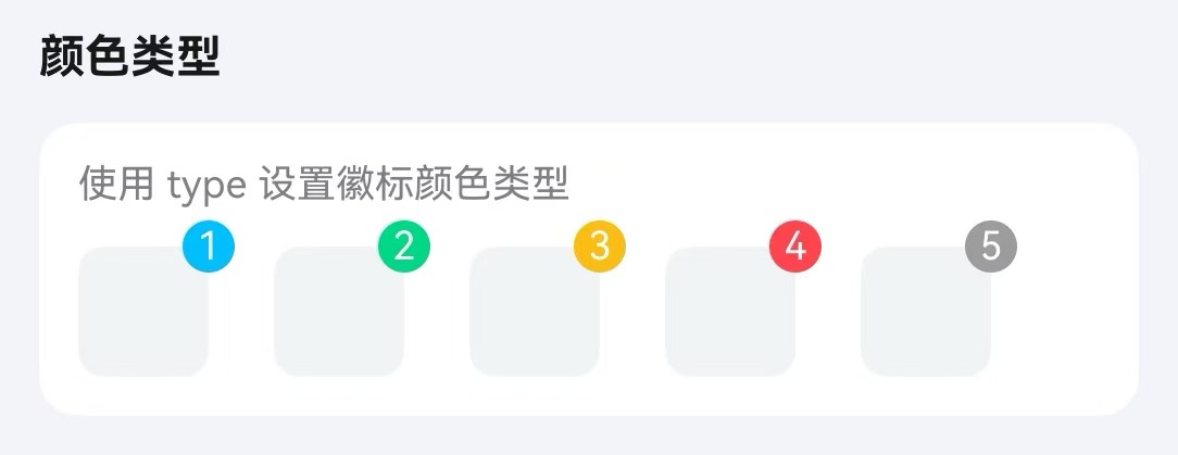
};颜色类型
通过 type 属性设置徽标颜色。
点我查看代码
typescript
Row({ space: 20 }) {
  TnBadge({ value: 1, type: "primary", absolute: true }) {
    BadgeDemoBlock();
  };
  TnBadge({ value: 2, type: "success", absolute: true }) {
    BadgeDemoBlock();
  };
  TnBadge({ value: 3, type: "warning", absolute: true }) {
    BadgeDemoBlock();
  };
  TnBadge({ value: 4, type: "danger", absolute: true }) {
    BadgeDemoBlock();
  };
  TnBadge({ value: 5, type: "info", absolute: true }) {
    BadgeDemoBlock();
  };
}
定位模式
通过 absolute 和 badgePosition 属性设置绝对定位,可配合 xOffset、yOffset 微调位置。
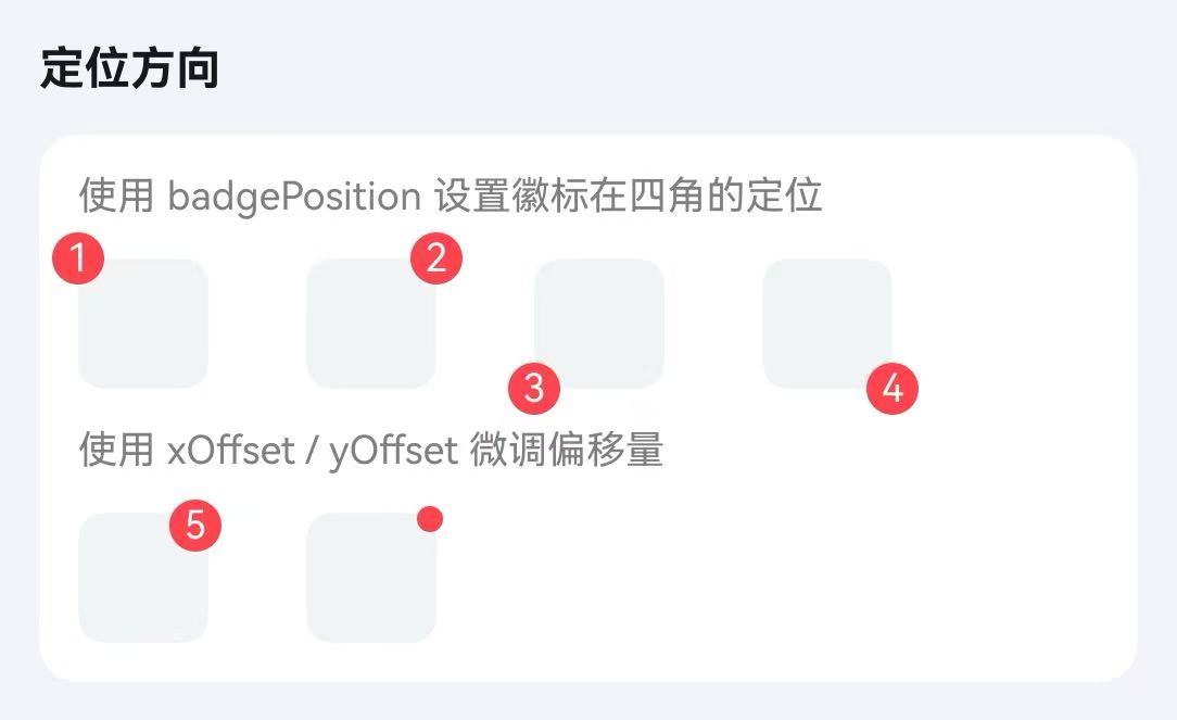
点我查看代码
typescript
Flex({ wrap: FlexWrap.Wrap, space: { main: LengthMetrics.vp(30), cross: LengthMetrics.vp(16) } }) {
  TnBadge({ value: 1, badgePosition: "top-left", absolute: true }) {
    BadgeDemoBlock();
  };
  TnBadge({ value: 2, badgePosition: "top-right", absolute: true }) {
    BadgeDemoBlock();
  };
  TnBadge({ value: 3, badgePosition: "bottom-left", absolute: true }) {
    BadgeDemoBlock();
  };
  TnBadge({ value: 4, badgePosition: "bottom-right", absolute: true }) {
    BadgeDemoBlock();
  };
}
API
Props
| 参数 | 说明 | 类型 | 默认值 |
|---|---|---|---|
| value | 徽标内容,以 icon- 开头时渲染为图标 | string | number | - |
| max | 最大值,超过显示 {max}+ | number | - |
| type | 颜色类型 | TnComponentColorType | "danger" |
| dot | 是否显示为圆点 | boolean | false |
| showZero | value 为 0 时是否显示 | boolean | true |
| bgColor | 自定义背景色 | ResourceColor | - |
| textColor | 自定义文字色 | ResourceColor | - |
| badgeSize | 徽标尺寸 | "sm" | "lg" | "xl" | - |
| fontSize | 自定义字体大小 | number | string | - |
| bold | 是否加粗字体 | boolean | false |
| absolute | 是否使用绝对定位 | boolean | true |
| badgePosition | 绝对定位位置 | "top-left" | "top-right" | "bottom-left" | "bottom-right" | "top-right" |
| xOffset | 水平偏移量(vp) | number | 0 |
| yOffset | 垂直偏移量(vp) | number | 0 |
Slots
| 名称 | 说明 |
|---|---|
| defaultBuilder | 默认内容插槽,徽标将定位在该内容的角落 |
Events
| 事件名 | 说明 | 回调参数 |
|---|---|---|
| onBadgeClick | 点击徽标时触发 | - |